- Visual style
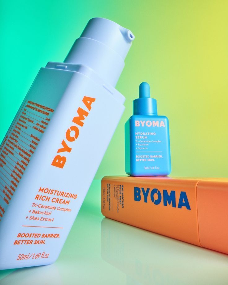
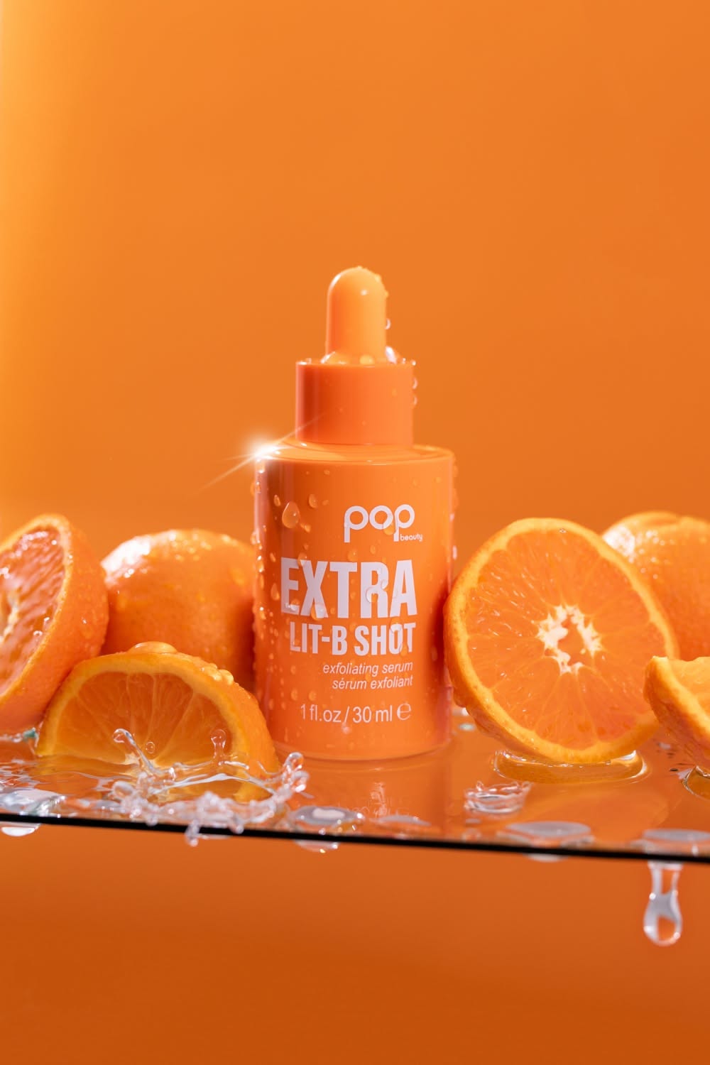
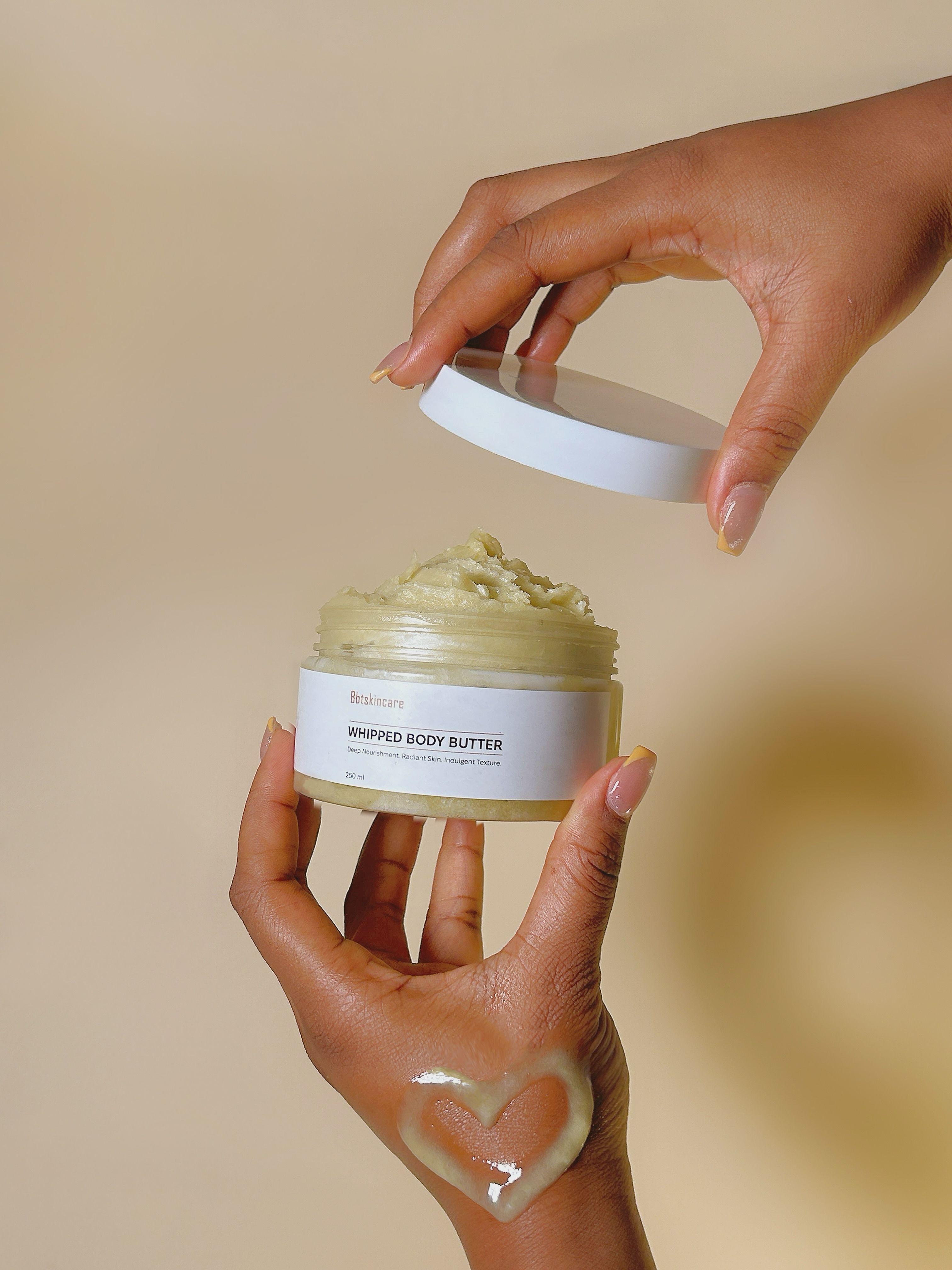
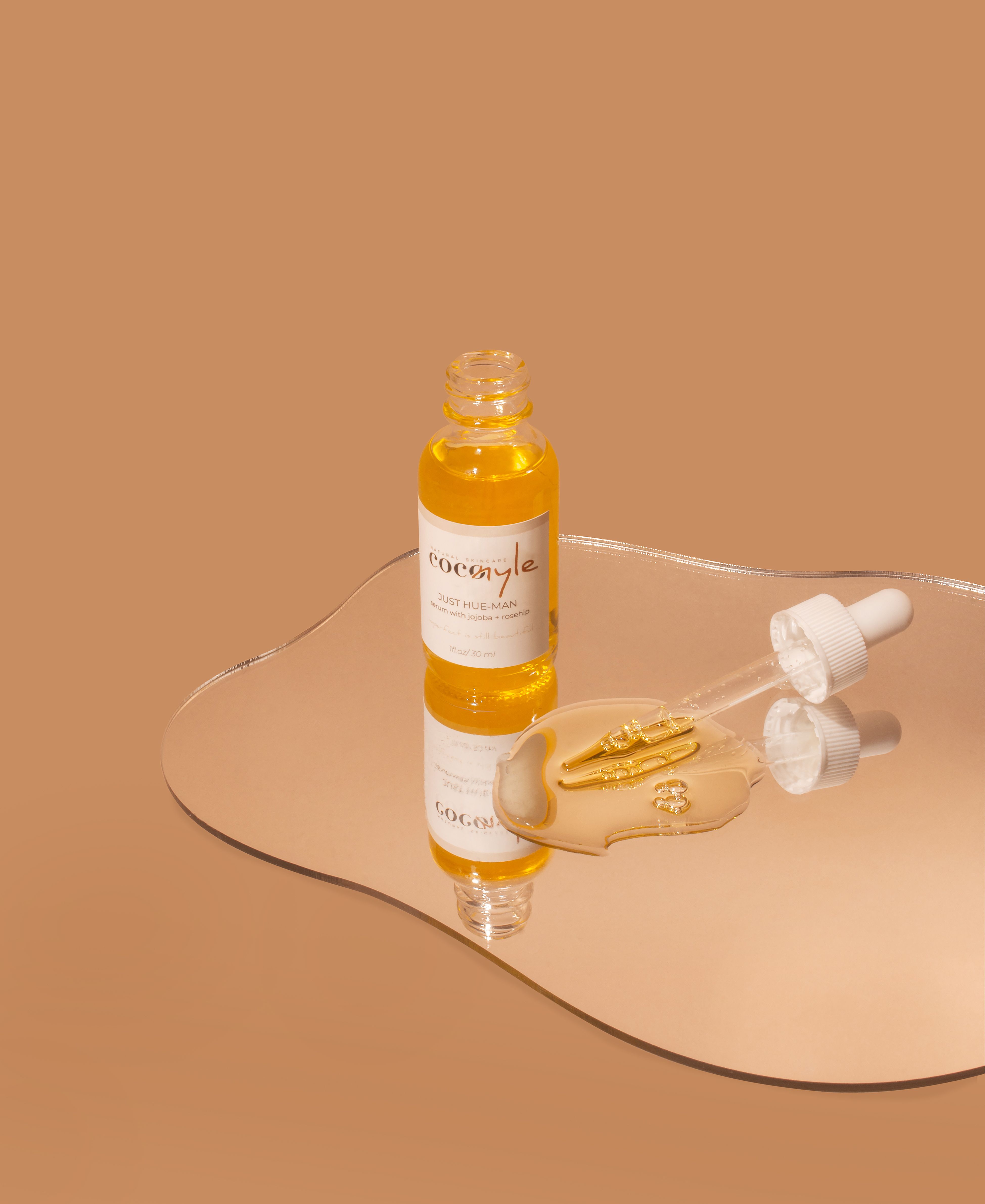
- A vibrant, saturated Pop-Art palette consisting of five dominant hues: periwinkle lavender #A4B6F7, vivid safety orange #FF6B35, electric cyan blue #27B4F5, vibrant mint green #5AE39D, and chartreuse lime yellow #D8F84C. Clean commercial colour grading with boosted vibrance, high tonal clarity, and sharp contrast between warm orange accents and cool blue-green tones. Contemporary Gen-Z beauty campaign photography characterized by bold colour blocking, clean geometric minimalism, and an energetic, playful commercial mood. Clinical skincare meets high-fashion graphic product styling.
- Camera
- Shot with a medium-telephoto macro product photography lens feel (around 85mm to 100mm), low camera position close to the tabletop plane, deep focus preserving razor-sharp detail across typography, matte plastic textures, and dispenser seams, with a subtly softened background plane.
- Lighting
- Bright commercial high-key studio softbox lighting casting clean, soft-edged white specular highlights along the vertical bevels and rounded corners of each bottle. Diffused ambient fill keeps packaging shadows soft and luminous, while directional illumination from the top and right accentuates packaging geometry and generates clear mirror reflections on the glossy mint tabletop.