- Visual style
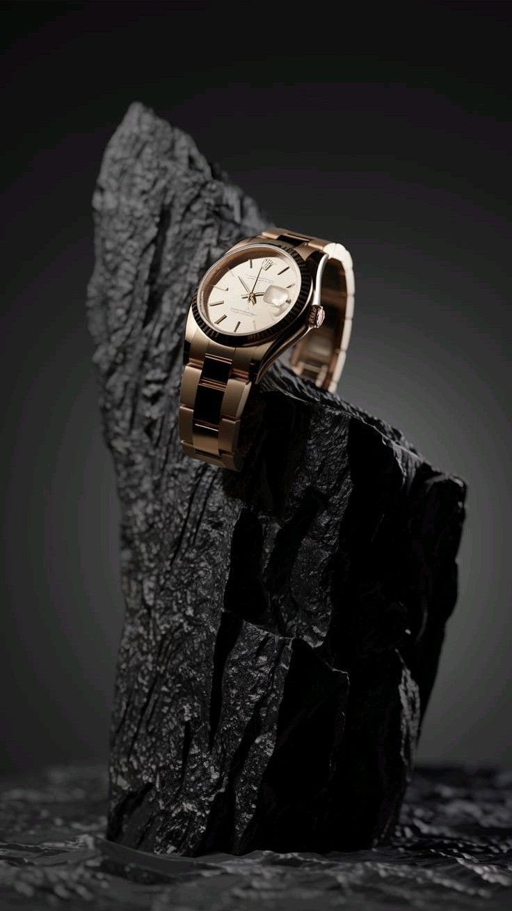
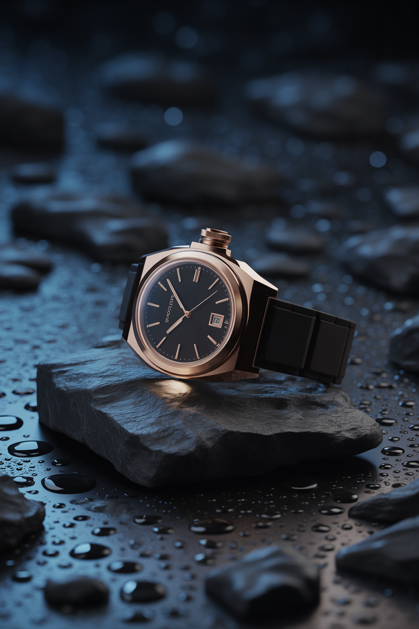
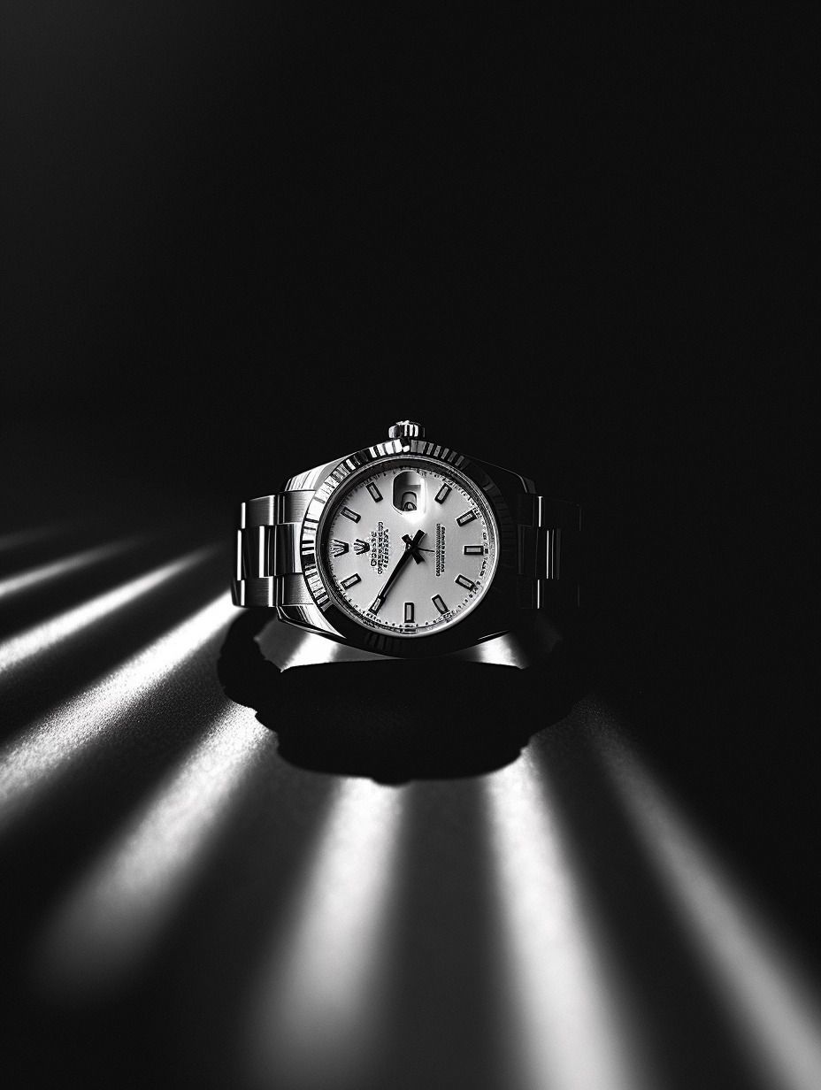
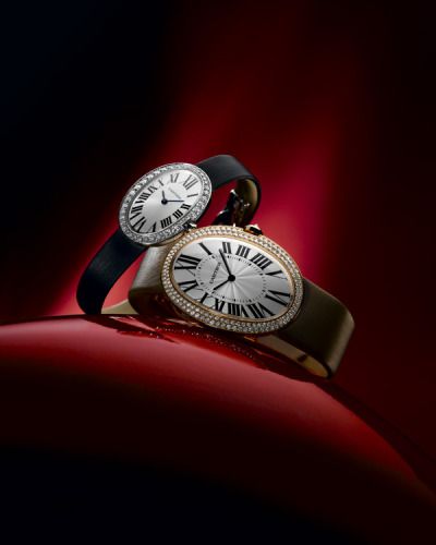
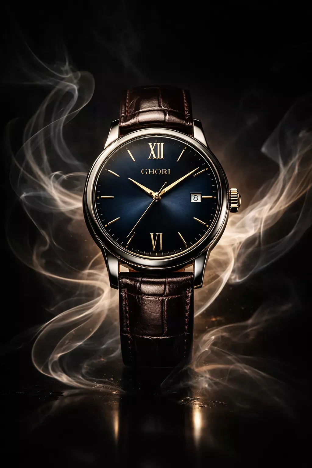
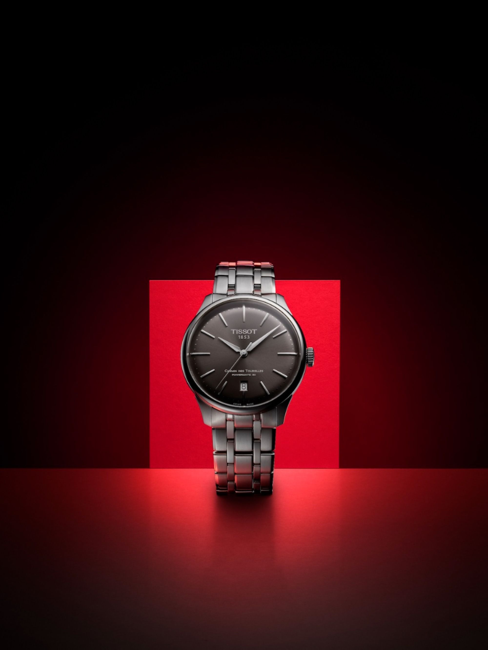
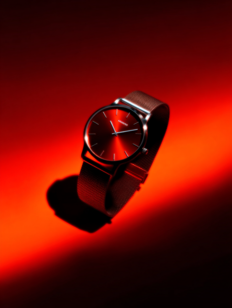
- A warm metallic and deep monochromatic color palette consisting of dominant tones #B87B66 (rose gold), #1C1B1D (charcoal rock), #D6C4B8 (champagne dial), #3B3B3F (neutral slate grey), and #0C0C0D (shadow black). The color grading is rich and low-key with high tonal contrast, warm glowing highlights on the precious metal, and desaturated neutral black-and-grey surroundings. Premium commercial luxury watch advertisement aesthetic. The mood is powerful, dark, sophisticated, and monolithic, emphasizing prestige, craftsmanship, and elemental resilience through the juxtaposition of refined fine jewelry against raw organic rock.
- Camera
- Shot with a medium-telephoto macro product lens (approximately 90mm-100mm equivalent) providing straight, undistorted geometry and natural compression. Moderate depth of field keeps the entire watch face, bezel, and front links razor-sharp, with a soft optical falloff toward the rear bracelet curve and background gradient.
- Lighting
- Sophisticated low-key studio lighting with a precise soft key light positioned upper-right, defining the polished bevels of the rose gold case, bracelet facets, and fluted bezel ridges. A subtle rim light traces the left silhouette of the dark stone pillar, separating it cleanly from the background. Controlled specular highlights accent the flat crystal and metallic link surfaces while preserving deep, velvety shadows across the textured rock.