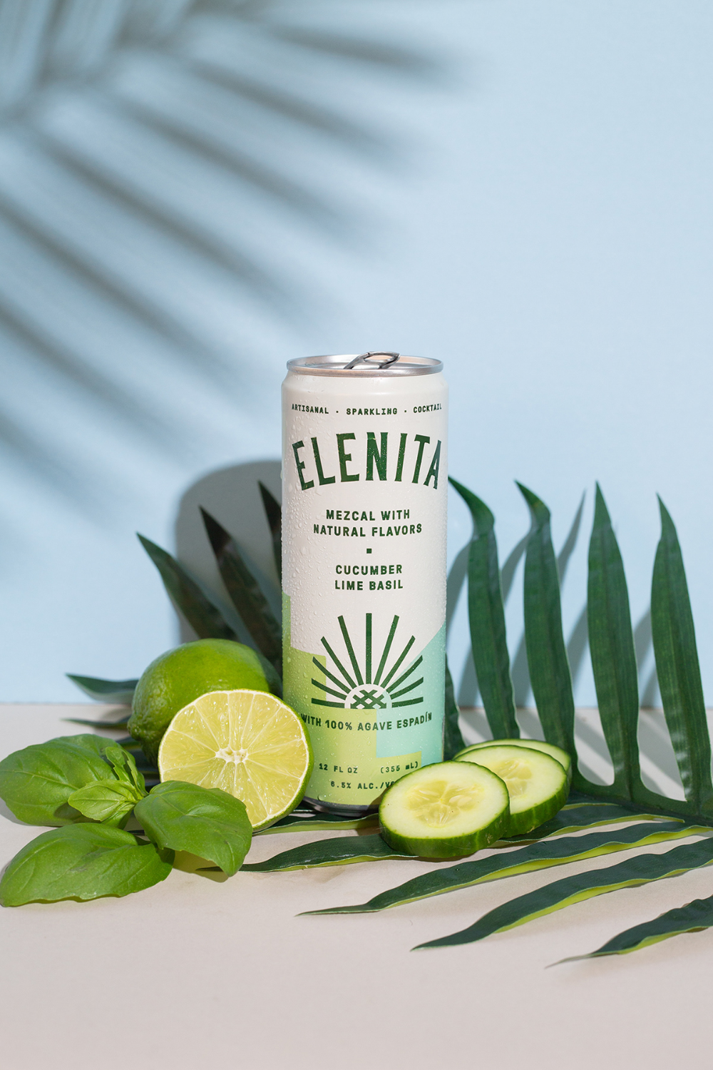
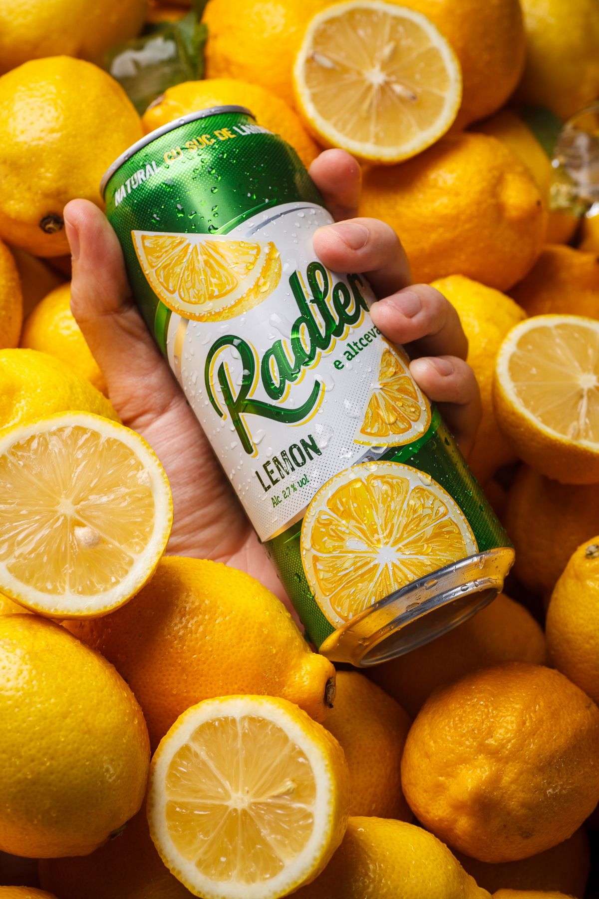
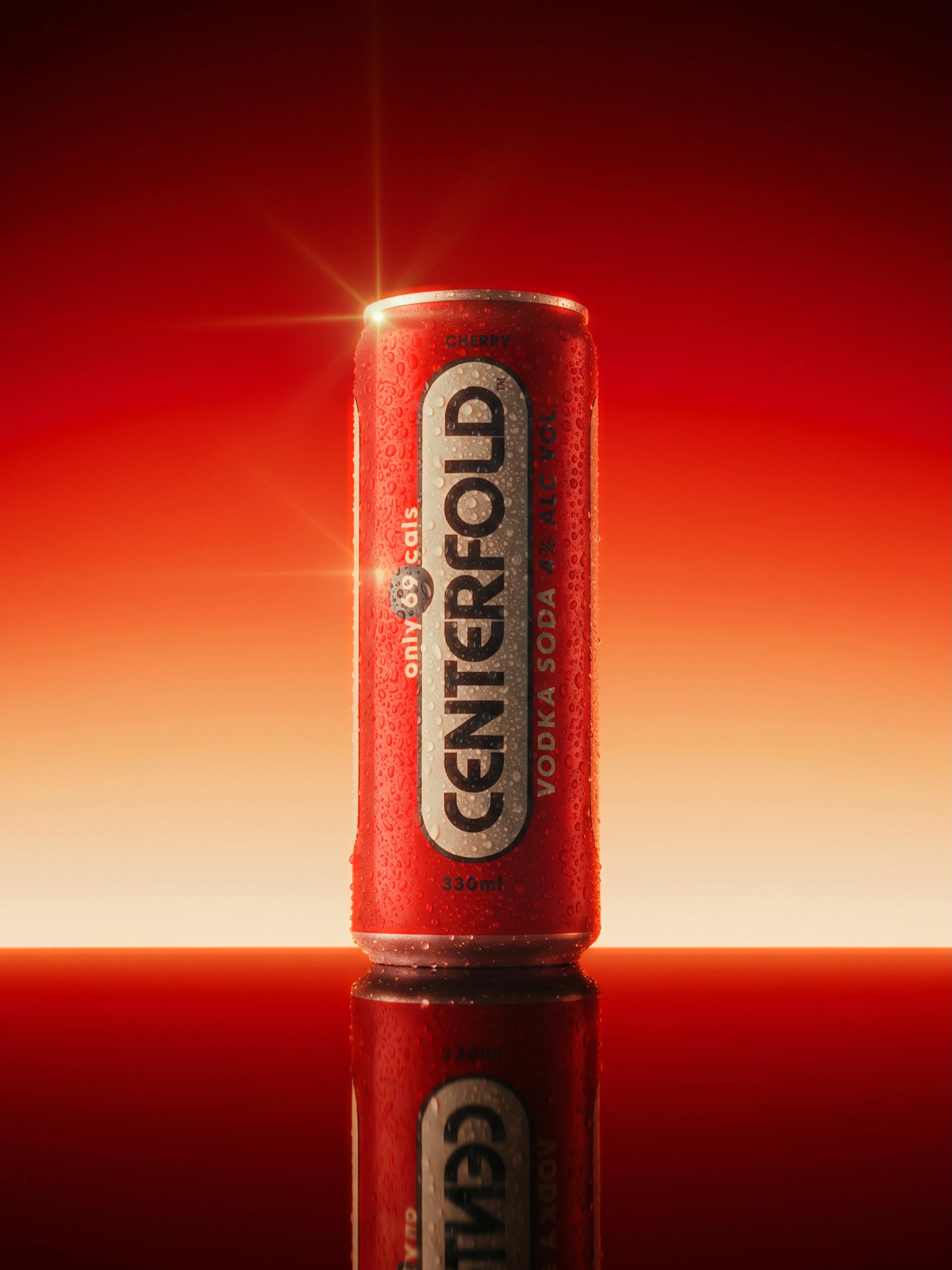
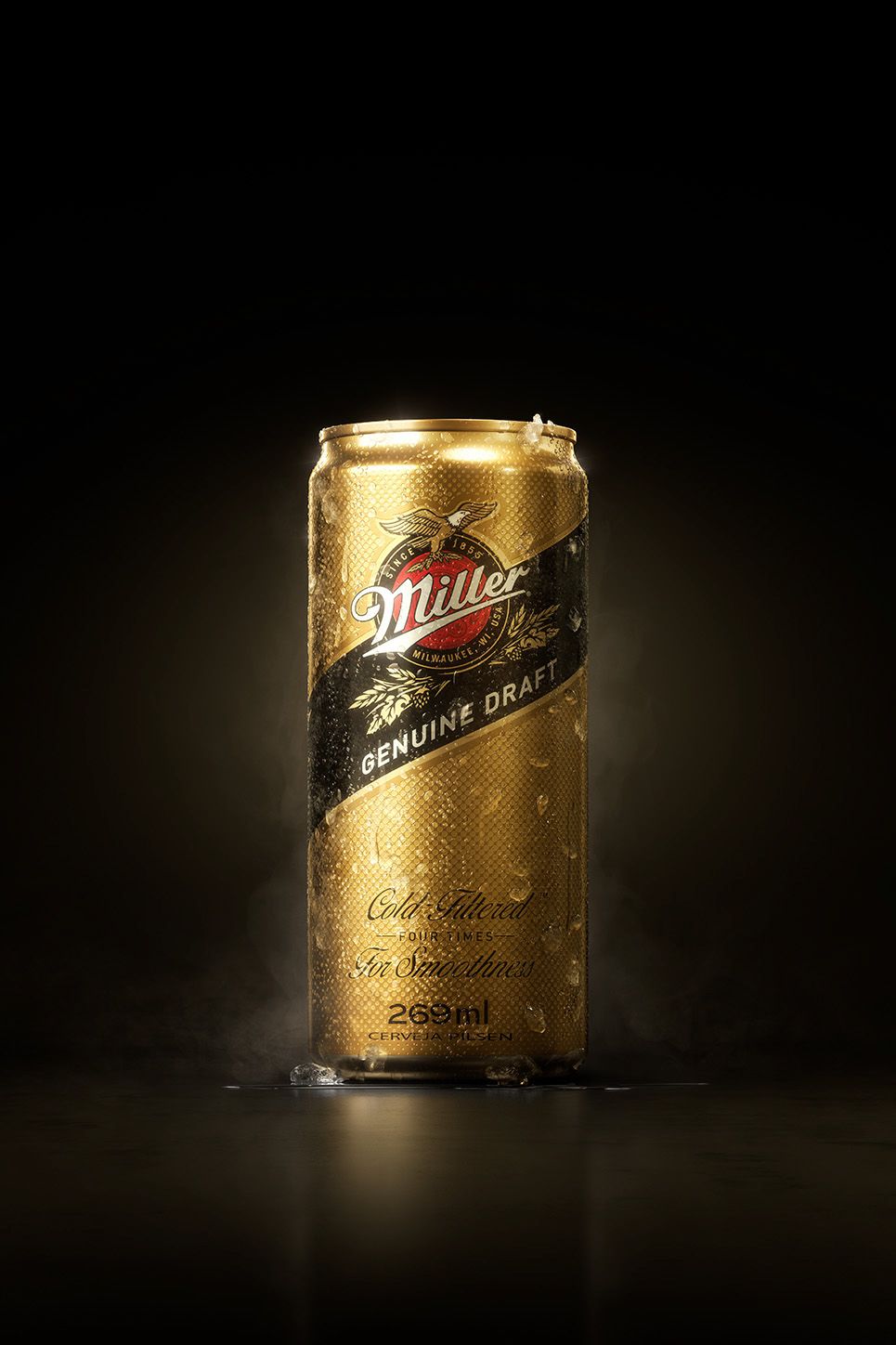
- Visual style
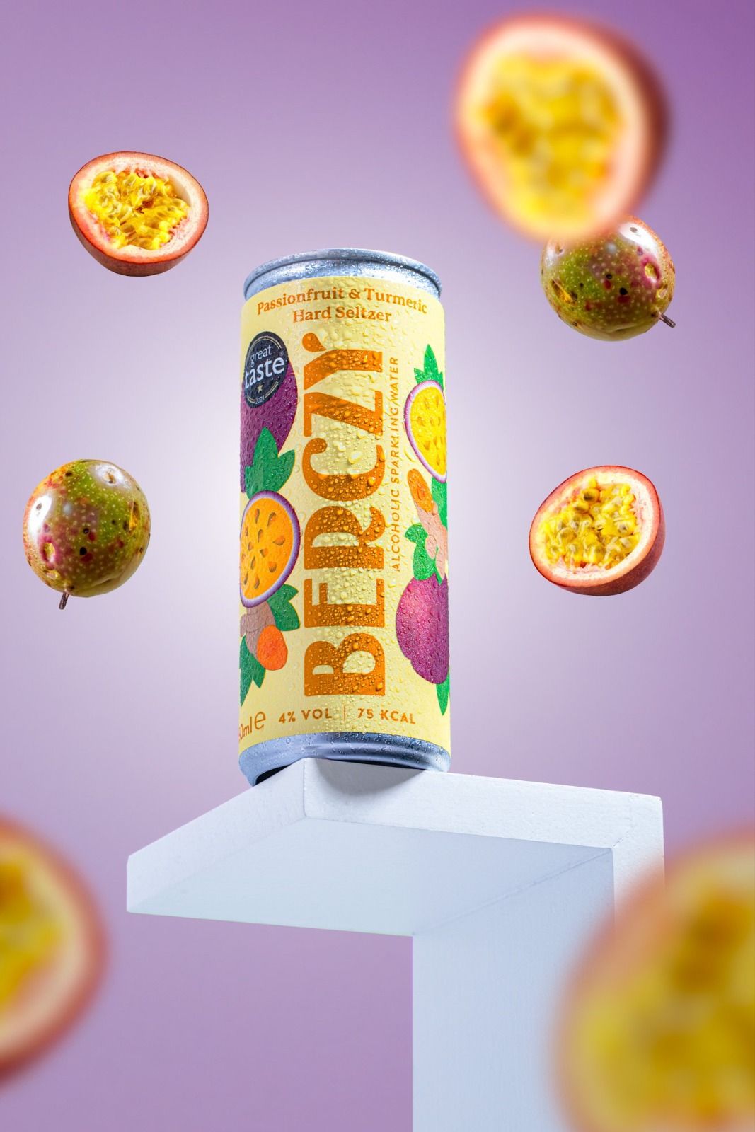
- Five dominant colors: Pastel Lavender (#B89AC8), Pale Can Yellow (#F6E482), Ripe Fruit Purple (#7D3B5E), Passionfruit Pulp Yellow (#E8A71F), and Studio White (#EBEFF3). Color palette relies on a vibrant complementary contrast between warm tropical yellows and cool pastel purples, finished with a bright, clean commercial color grade with saturated fruit accents and neutral white balance. Vibrant, refreshing commercial beverage advertising and studio product photography. The atmosphere is energetic, summery, and premium, evoking natural flavor, crisp refreshment, and contemporary lifestyle branding.
- Camera
- Medium close-up product shot captured with an 85mm to 105mm macro-feel telephoto lens at eye-level to slightly low angle. A moderate depth of field ensures the hero can and mid-plane fruits are tack-sharp, while foreground and distant background fruits dissolve into smooth, creamy bokeh.
- Lighting
- Crisp, bright commercial studio lighting with soft dual-source diffusion. Balanced key and fill lights illuminate the can's front label and create specular highlights across individual water droplets and fruit pulp. A soft backlight creates a subtle separation rim along the can edges against the illuminated lavender background.