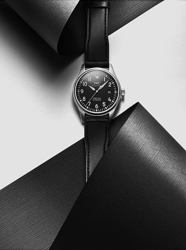
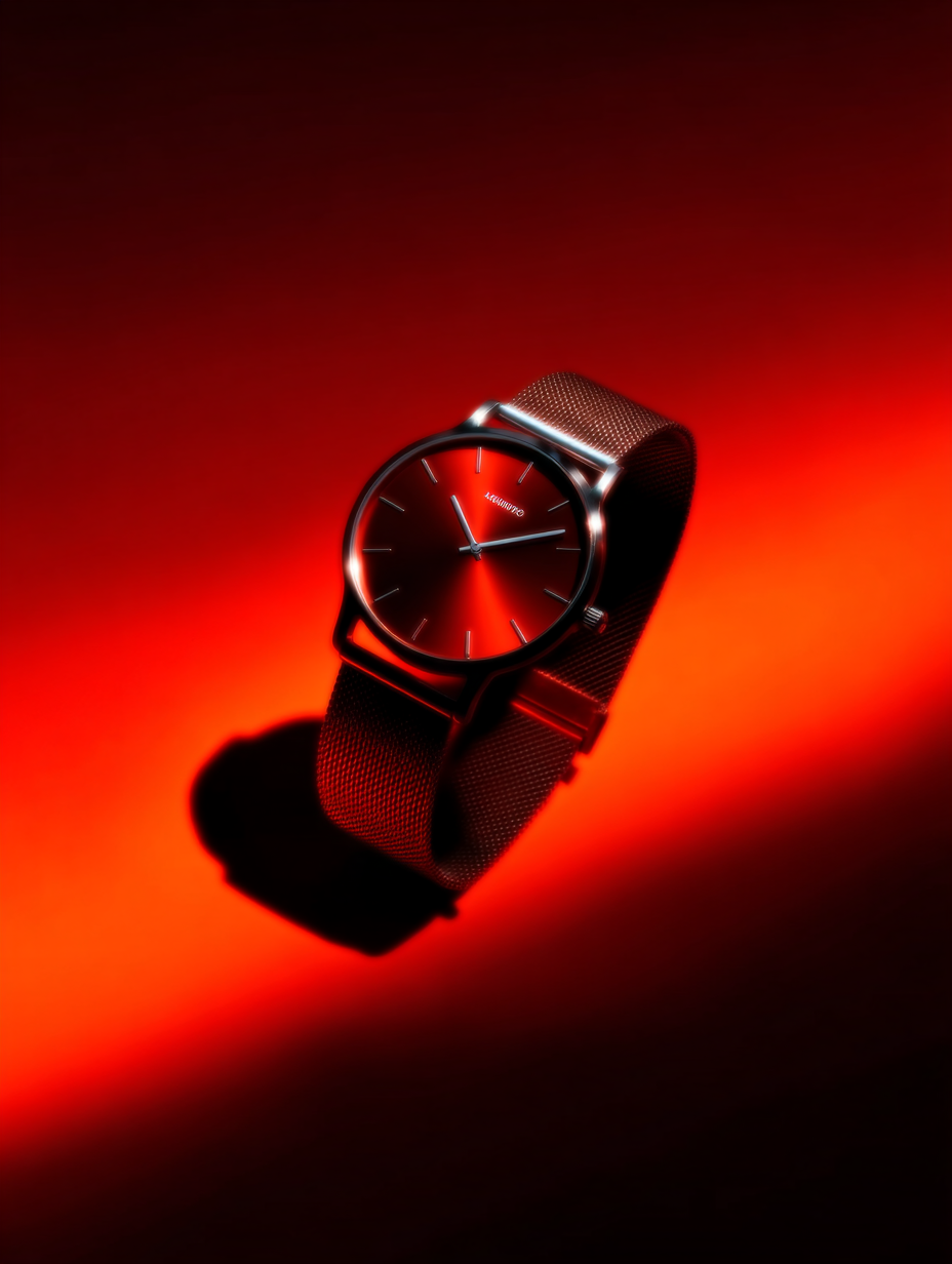
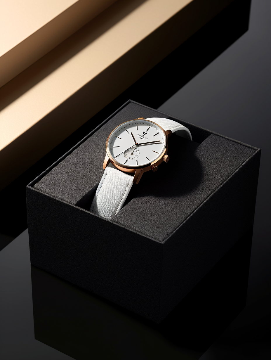
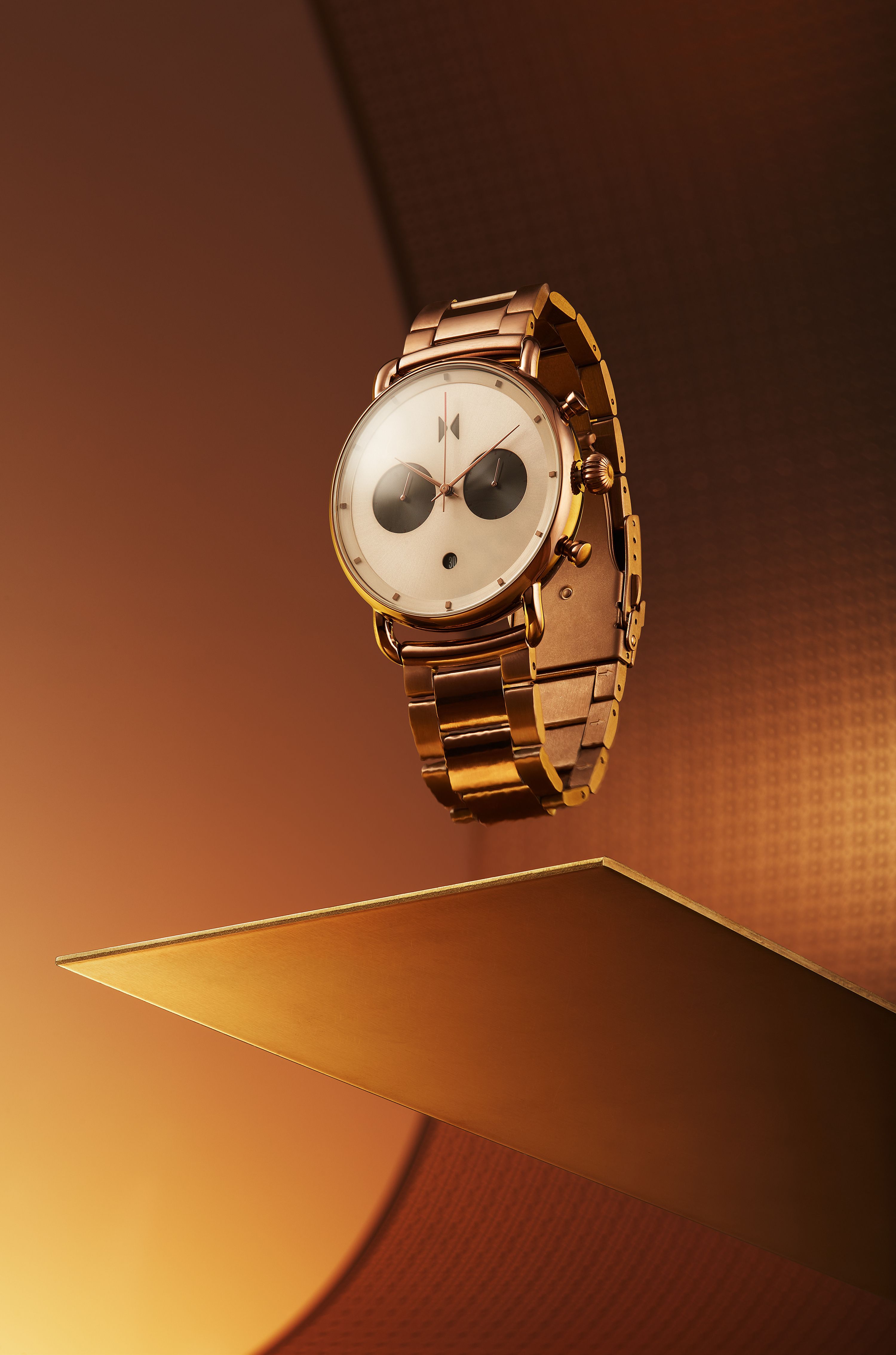
- Visual style
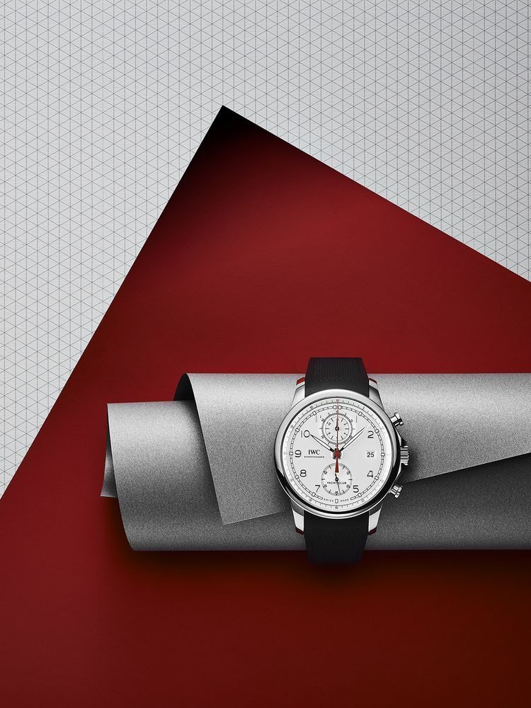
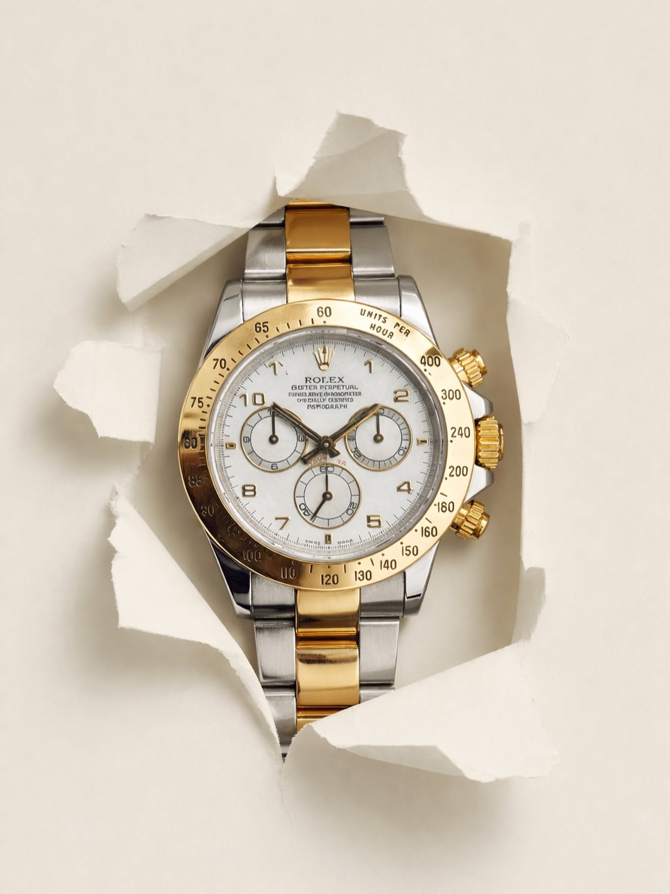
- A sophisticated, high-contrast tri-color palette anchored by deep crimson red (#8F0815), shimmering metallic silver-grey (#9AA0A6), pure optic white (#FFFFFF), neutral dark grey grid tone (#DCDDDE), and rich charcoal black (#1A1A1A). The color grading is clean, modern, and punchy, emphasizing high tonal separation, vibrant red saturation, and pristine neutral whites and metallics. Contemporary luxury horology advertising with a strong graphic and constructivist aesthetic. The mood is sophisticated, precise, bold, and architectural, blending minimalist set design with immaculate Swiss-style product presentation.
- Camera
- Straight-on, eye-level macro product photography framing captured at a medium-close distance. A standard-to-telephoto macro focal length provides flat, undistorted geometric perspective, maintaining sharp parallel lines on the background grid and true-to-life watch proportions. Deep depth of field ensures tack-sharp focus from the watch dial face to the background paper textures.
- Lighting
- Precision commercial studio lighting with a soft, directional key light originating from the upper-right quadrant. The illumination creates smooth, subtle gradient falloff across the flat planes of the crimson cardstock and soft, elongated cast shadows beneath the rolled metallic scroll. Crisp specular highlight strips trace the curvature of the polished watch bezel, pushers, crown, and the curved apex of the silver metallic paper without creating unwanted glare across the dial crystal.