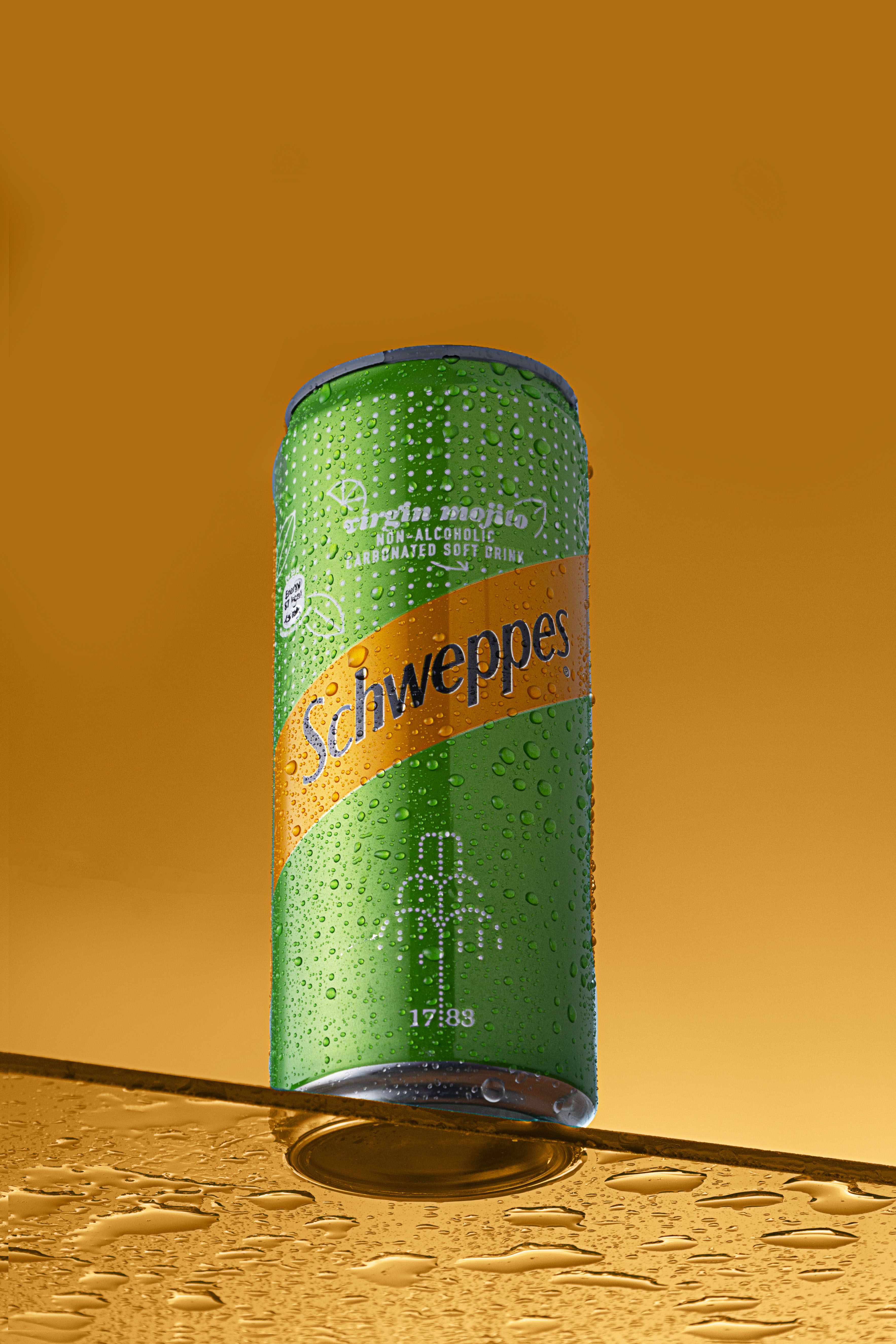
- Visual style
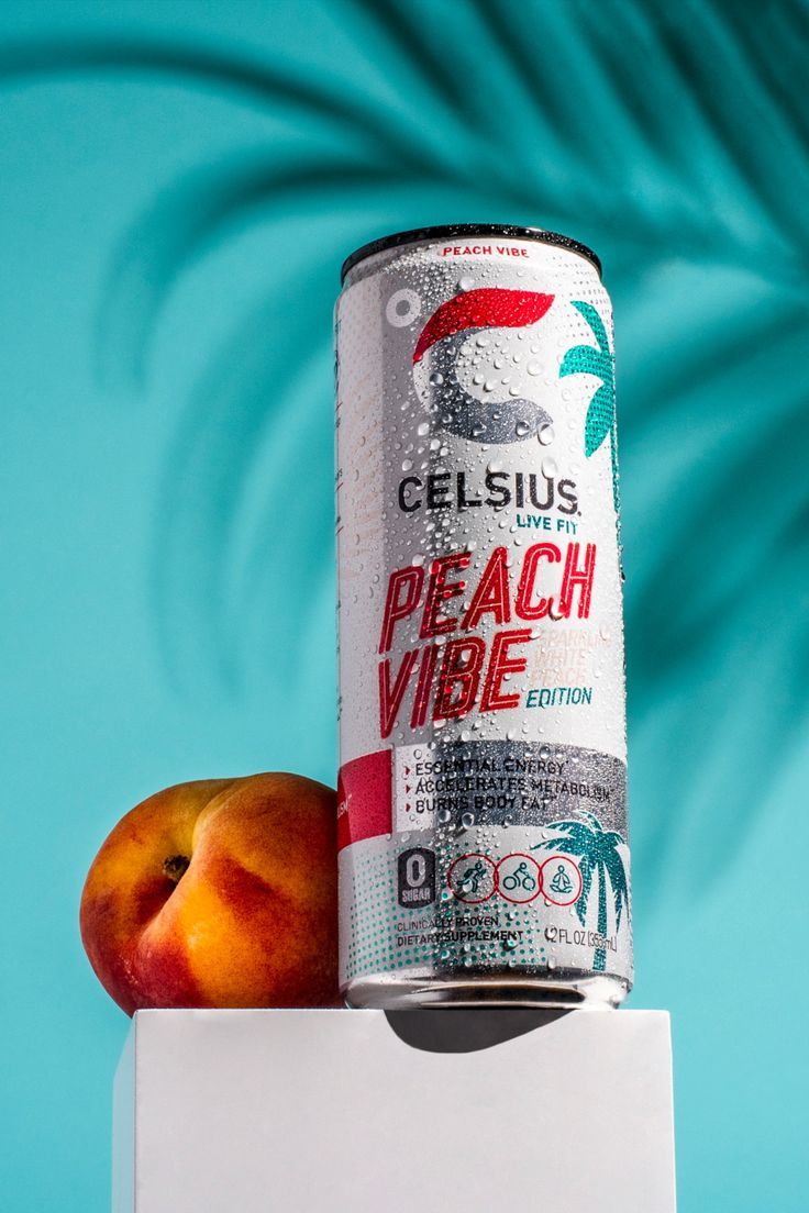
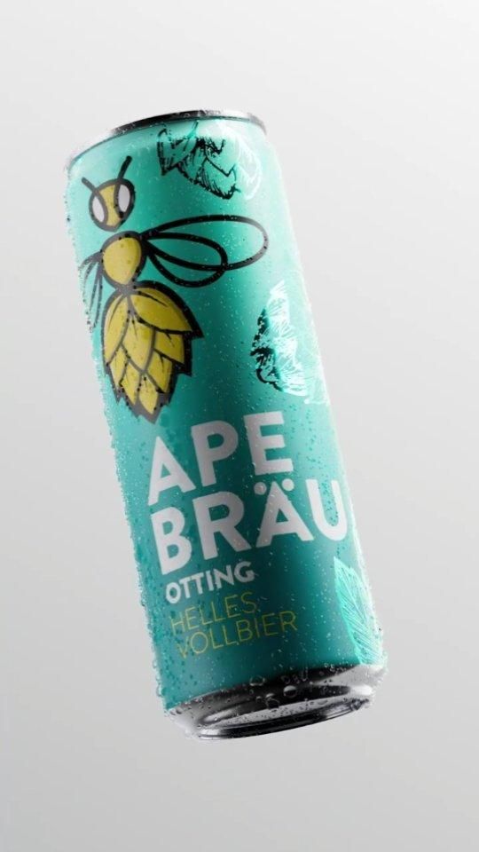
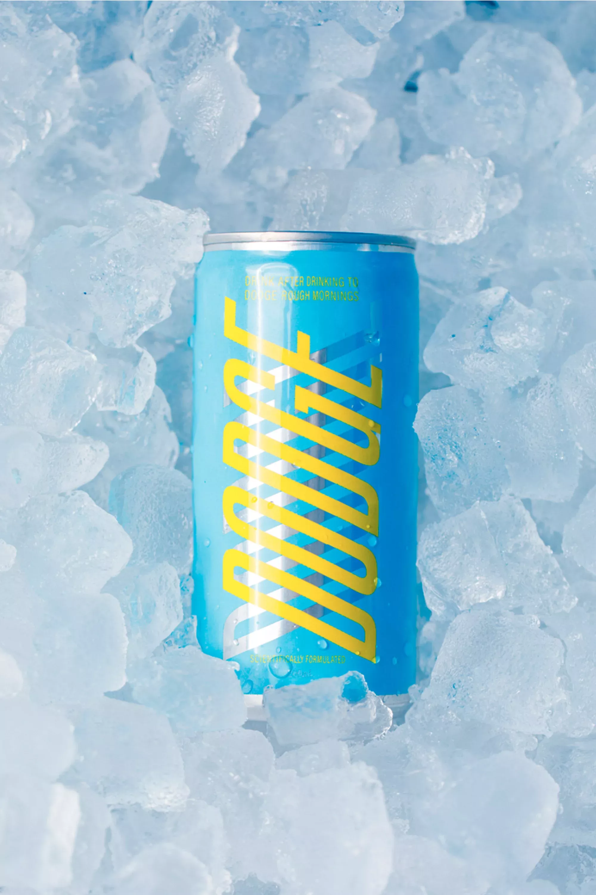
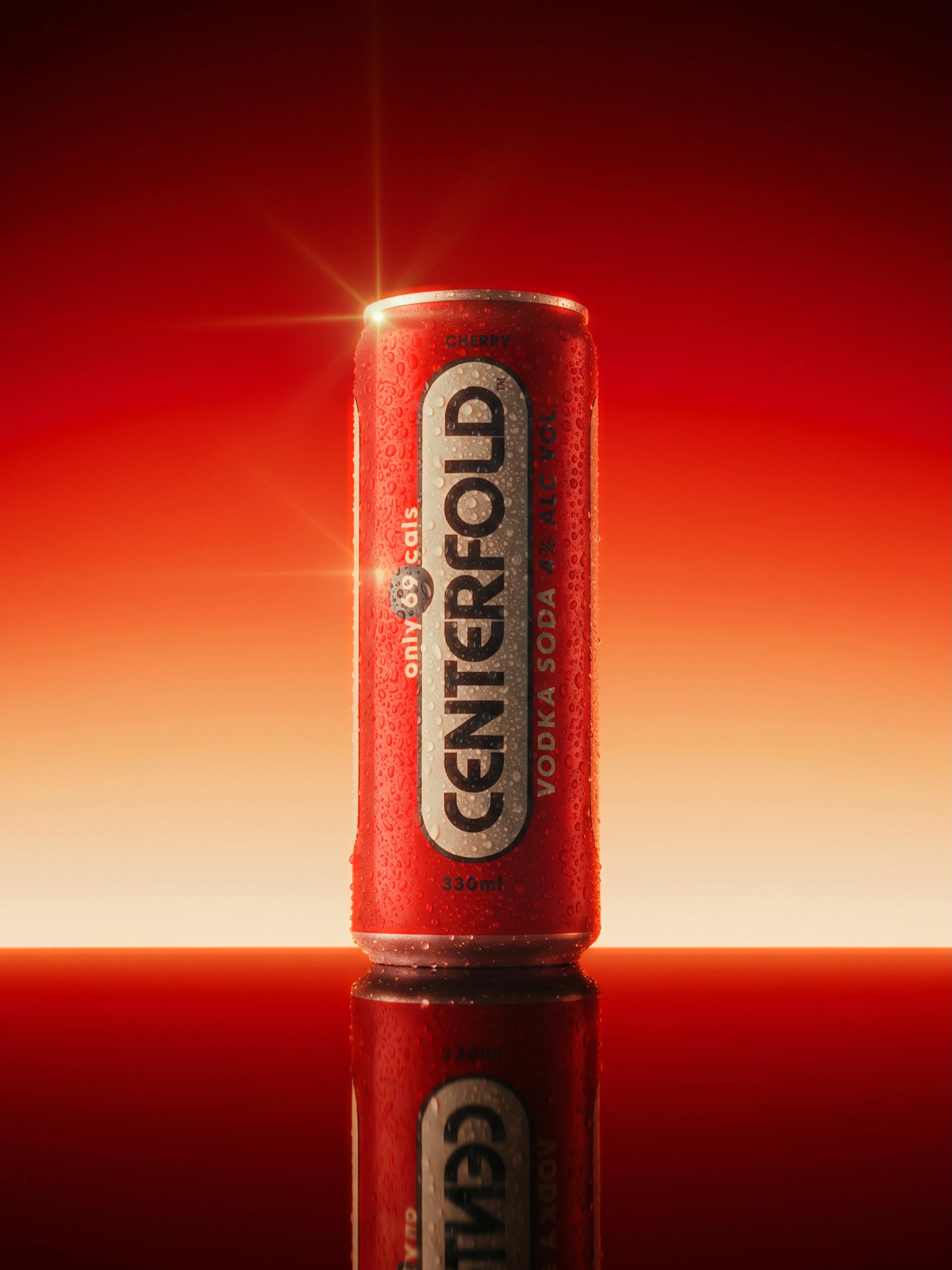
- A bold, high-saturation tropical palette centered around vibrant cyan, warm peach coral, juicy yellow, clean white, and dark charcoal accents. The color grading delivers punchy contrast, luminous midtones, and clean highlights that accentuate the crisp, chilled product aesthetic. Dominant colors: vibrant turquoise cyan (#00A5B5), peach coral-red (#D9383A), warm apricot gold (#E58535), pure matte white (#FFFFFF), and deep charcoal (#1E2328). Vibrant, high-energy commercial beverage advertising photography with a refreshing tropical summer aesthetic. The mood is clean, active, and invigorating, conveying icy thirst-quenching freshness through precise lighting, water droplets, and fruit pairing.
- Camera
- Shot with a medium-telephoto macro lens (approx. 85mm to 105mm feel) at eye level, offering zero perspective distortion and keeping the can's vertical edges perfectly parallel. A moderate depth of field ensures tack-sharp focus from the front curve of the peach through the full can typography, while softly blurring the backdrop shadows.
- Lighting
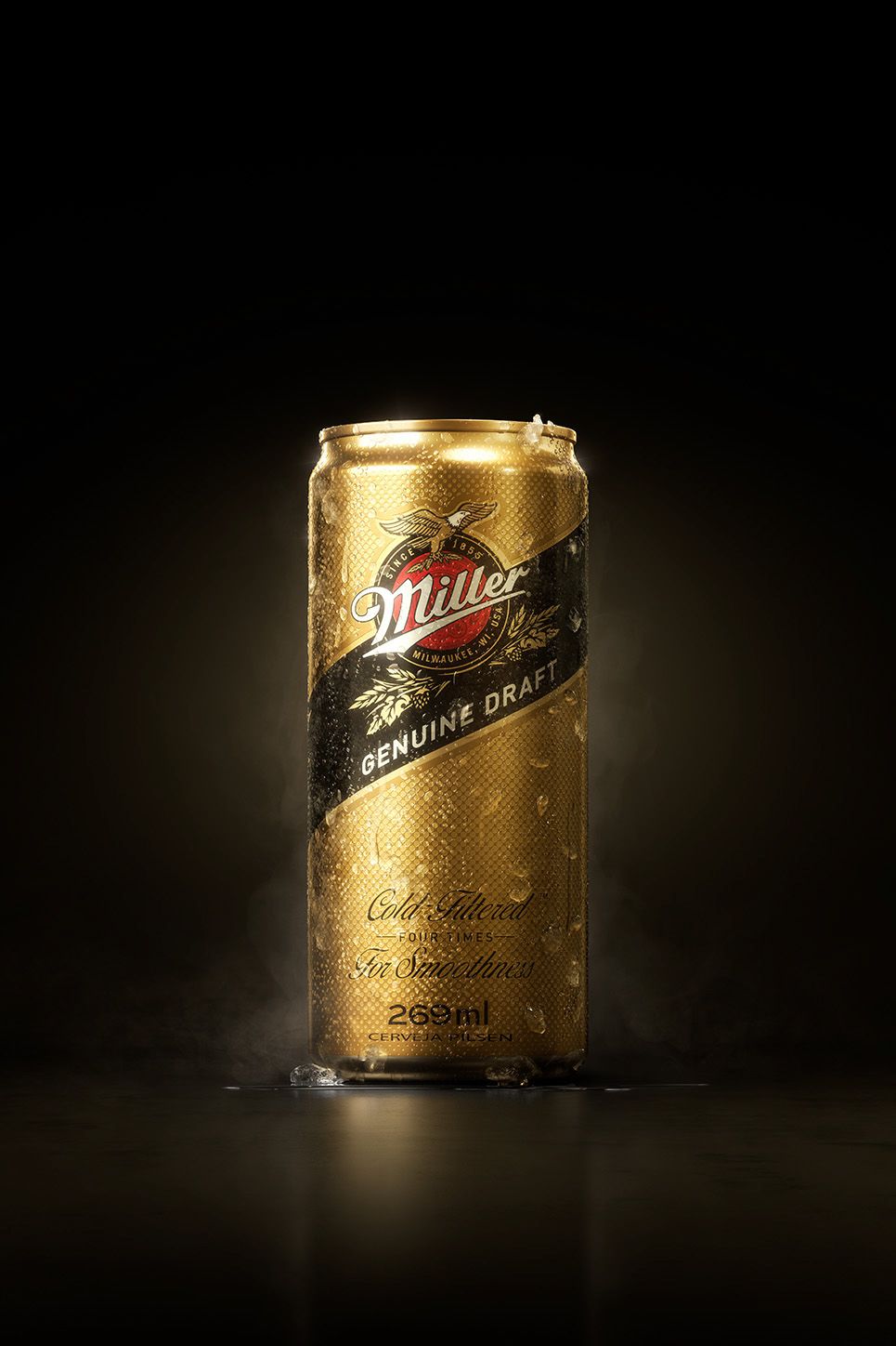
- Bright, high-key commercial studio lighting with a crisp main key light positioned from the front-left, illuminating the peach and casting sharp specular glints across every water droplet on the can. Subtle fill maintains detail on the right side, while distinct cast lighting creates the palm leaf shadow patterns across the cyan backdrop.