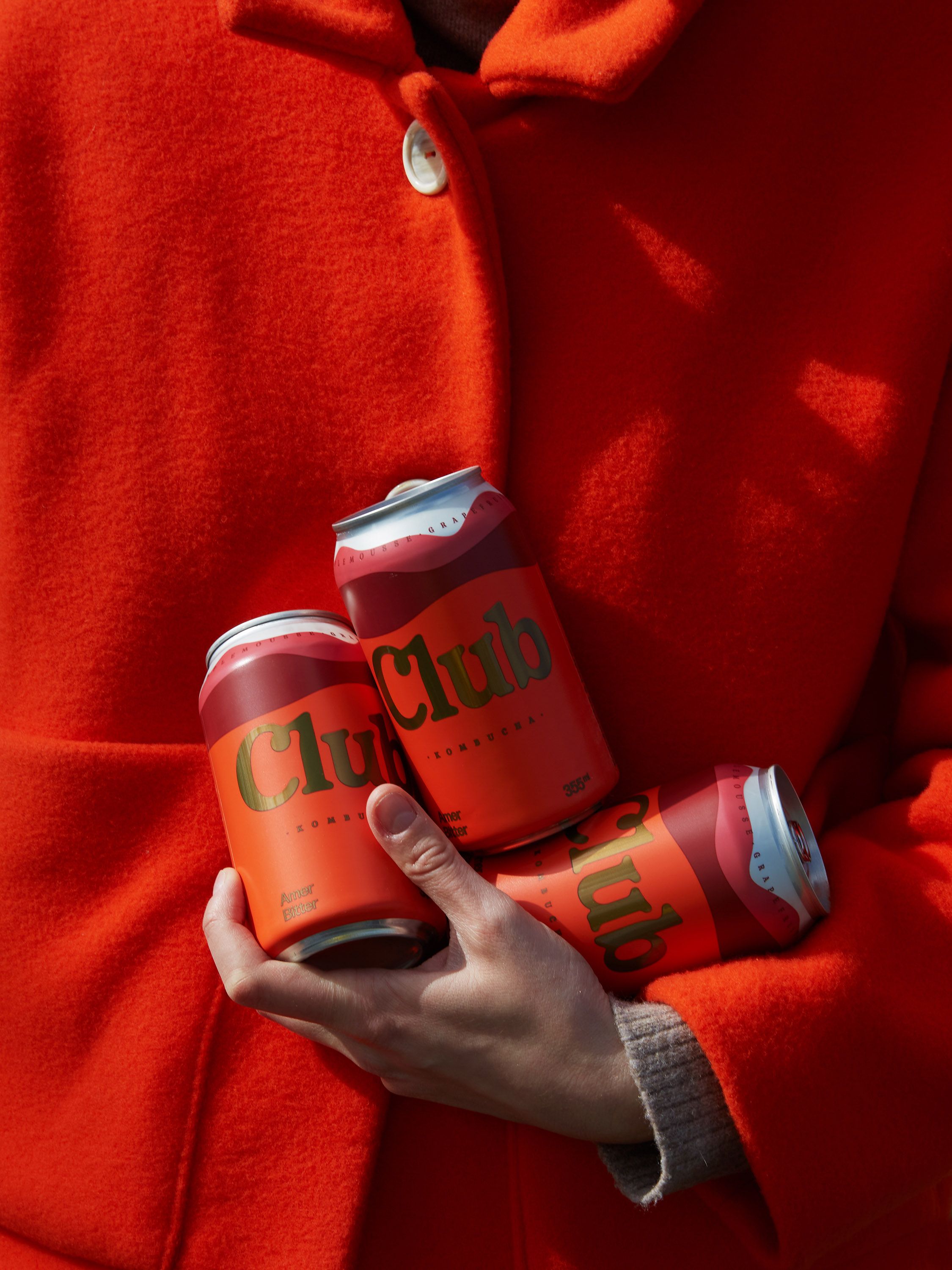
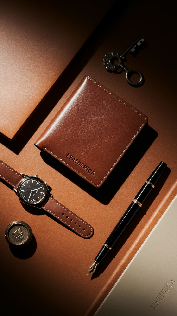
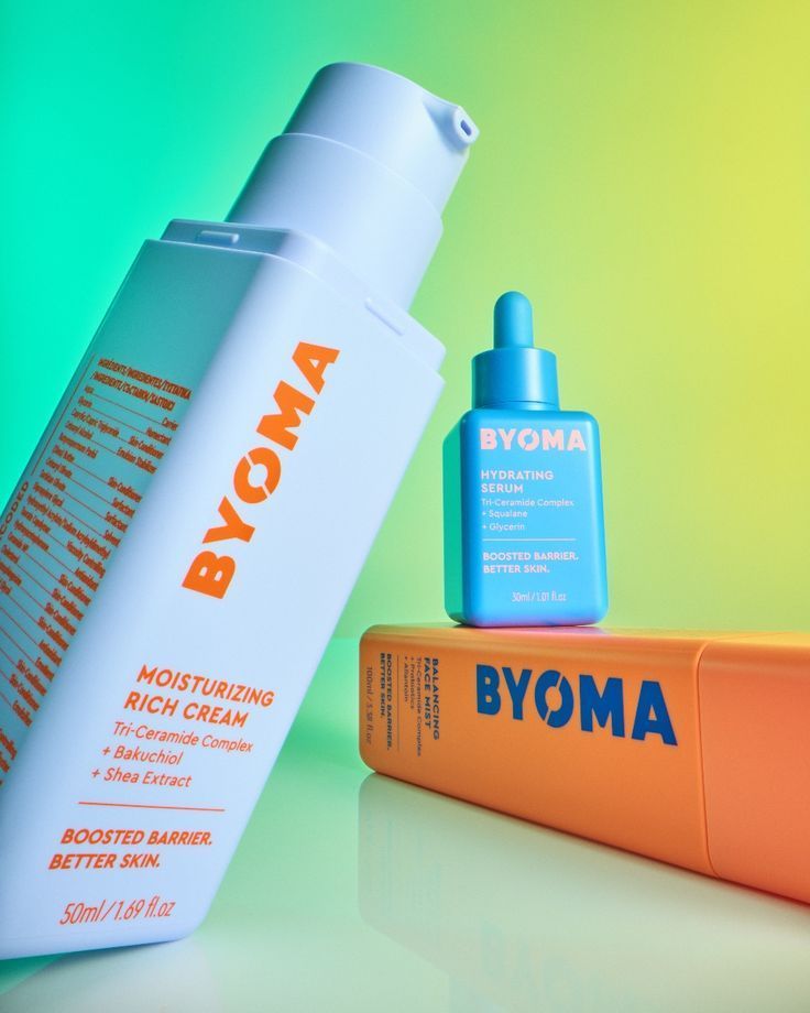
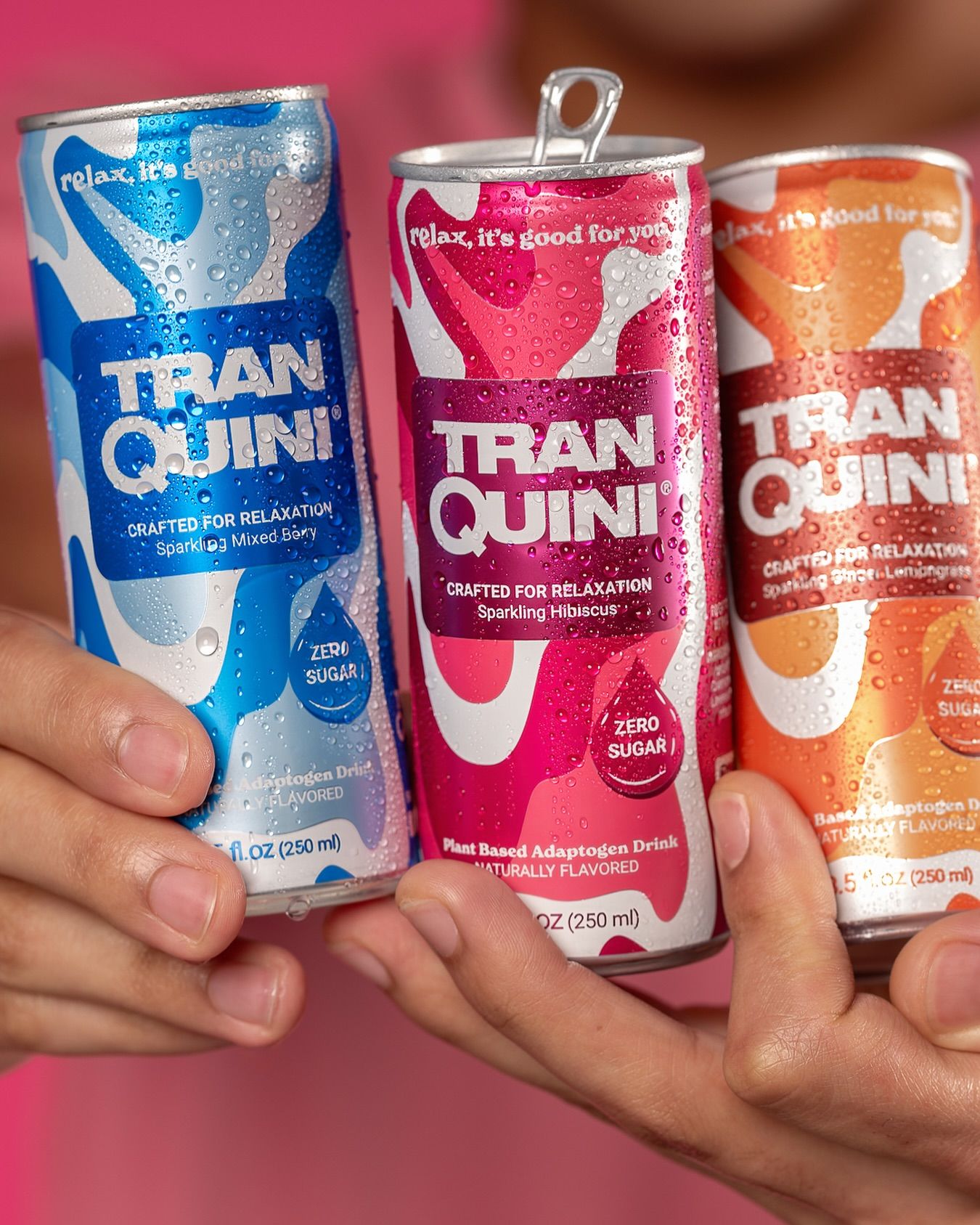
These are static ad examples from real DTC brands, not mockups that never ran. We collected 84 static ads that supplement, skincare, fragrance, insole and protein brands actually put money behind on Facebook and Instagram, then broke each one down into the format behind it. Every format comes with a copy-ready AI prompt so you can make your own version.
Once you strip out the repeats (Happy Mammoth ran two near-identical "final call" notices, Asset ran the same line illustration twice), this static ads swipe file collapses into 63 distinct static ad formats in 8 families. Think of it as a library of Facebook static ad examples and Meta static ads examples you can steal the structure from, without copying anyone's creative.
For every format you get:
- What it is and why it works in a sentence or two
- Who ran it in the swipe file, named as an example
- A copy-ready AI image prompt with
[PRODUCT],[BRAND]and[CLAIM]placeholders
The prompts recreate the format, not anyone's ad. Paste them into GPT Image 2 or Nano Banana, swap in your product and your claim, and you have a test-ready static ad in minutes. Want motion? Feed the still into Seedance 2.5 as a first frame.
What is a static ad?
A static ad is a single still image ad: one visual, usually a headline, and a call to action, with no video or animation. On Meta that means a static image ad in Feed, Stories or Reels placements. Statics are the fastest creative to make and test, which is why the brands below run so many static ad formats side by side instead of betting on one.
How to make static ads with AI (and use these as static ad templates)
Each prompt below works as a reusable static ad template. Two rules keep the output usable:
- Use your real product. Upload a clean photo of your pack as a reference image and tell the model to keep the label exact. AI-invented packaging is the fastest way to lose trust.
- Only claim what you can prove. Every
[CLAIM]and[STAT]slot is for a claim you can back up. Don't let the model write numbers for you.
Which model for which job: GPT Image 2 is strong on readable UI text, so use it for screenshots and text-heavy formats. Nano Banana is great at editing your real product photo into a new scene. These work as AI prompts for Facebook ads, Instagram and TikTok statics alike; just set the aspect ratio (1:1 or 4:5 for Feed, 9:16 for Stories and Reels).
Jump to a static ad format family
- Native ad examples: static ads that look like a phone screen (13 prompts)
- Handwritten, lo-fi and ugly ad examples (10 prompts)
- Comparison ad examples: us vs them and before and after (10 prompts)
- News-style and advertorial static ads (5 prompts)
- Copy-led static ad ideas: hooks and explainers (7 prompts)
- Illustration and 3D static ad examples (6 prompts)
- Offer and urgency static ads for ecommerce (4 prompts)
- Pattern interrupt ad examples: memes, posters and weird photos (8 prompts)
1. Native ad examples: static ads that look like a phone screen
The biggest family in the swipe file, and the most common kind of native ads examples on Meta right now. These static ads borrow the UI of apps people already trust (Messages, Reddit, Trustpilot, Google) so the ad reads as a real moment instead of a brand talking. The scroll brain files it under "content," not "ad."
Prompting tip: AI models render UI best when you name the app layout, the status bar, and the exact text in quotes. Keep copy short. Two or three lines per bubble.
1. Instagram Story screenshot ad example (Close Friends)
A selfie-style story with the product in hand and a stack of story text boxes on top. The green Close Friends ring makes it feel like a private recommendation, not a broadcast.
Seen in: GRUNS (Close Friends Story), Penrose Skin (Instagram Story Screenshot)


Vertical 9:16 screenshot of an Instagram Story, authentic phone UI with thin progress bars at top, green Close Friends star badge, small profile avatar and username "[USERNAME]". Background photo: casual mirror selfie in a sunlit bedroom, person holding [PRODUCT] toward camera, slight phone grain, natural window light. Overlaid Instagram-style white text boxes with black text reading "[HOOK QUESTION]" then "[SHORT PERSONAL ANSWER]". Realistic, unpolished, not an ad layout. Keep [PRODUCT] label exactly as reference image.2. Snapchat Story screenshot ad
A handheld outdoor snap with one translucent caption bar across the middle. Snapchat's single-line caption is instantly recognisable, and the low production value is the point.
Seen in: Penrose Skin (Snapchat Story Screenshot)

Vertical 9:16 Snapchat story screenshot, first-person POV hand holding [PRODUCT] on a balcony with trees and blue sky behind, slightly overexposed phone camera look. One Snapchat-style semi-transparent black caption bar across the middle of the frame with white text "[CASUAL ONE-LINE CAPTION]". No brand graphics, no logo overlays, authentic smartphone photo quality.3. iMessage text message ad example
A blue and grey bubble conversation between two friends, one skeptical, one converted. Readers eavesdrop on a recommendation instead of being sold to.
Seen in: GRUNS (iPhone Text Message)

Vertical screenshot of an iPhone Messages conversation, iOS status bar with time and battery, contact name "[FRIEND NAME]" at top. Grey incoming bubble: "[SKEPTICAL QUESTION ABOUT PROBLEM]". Blue outgoing bubbles: "[WHAT I SWITCHED TO: PRODUCT NAME]" and "[SPECIFIC RESULT IN PLAIN WORDS]". Grey reply: "[SHORT CONVINCED REACTION]". iOS keyboard bar at bottom, clean pixel-accurate UI, realistic typography, no ads styling.4. WhatsApp message ad
A WhatsApp chat where someone sends a photo of themselves with the product plus a short caption. The green bubble and doodle wallpaper scream "real person."
Seen in: Resilia (WhatsApp Text Message)

Vertical screenshot of a WhatsApp chat, beige doodle wallpaper, green outgoing message bubble containing a casual photo of a smiling person at home holding [PRODUCT] up to the camera, below the photo the caption "[PRODUCT NAME]. [HOW I USE IT, ONE LINE]" with a small emoji, grey timestamp and blue double ticks. Authentic WhatsApp UI, phone photo quality inside bubble.5. iPhone Notes app ad example
A Notes app entry that reads like a personal log ("my results after testing X") with a product photo pasted in. It frames the ad as someone's private research.
Seen in: Seed (iPhone Notes w/ image)

Vertical screenshot of the iPhone Notes app, yellow back arrow "Notes" top left, date stamp in grey. Bold title "[MY RESULTS FROM TRYING PRODUCT CATEGORY]:". Short bulleted list in system font: "[WEEK 1 OBSERVATION]", "[WEEK 2 OBSERVATION]", "[WEEK 4 OBSERVATION]". Below the list an embedded photo of [PRODUCT] on a kitchen counter in soft daylight. Clean Apple UI, realistic, no marketing graphics.6. Reddit screenshot ad example
A dark-mode Reddit post asking a relatable question, with a reply recommending the product. Reddit is where people go for honest answers, so the format borrows that credibility.
Seen in: Perfume Shark (Reddit Screenshot), Space Goods (Reddit Thread Screenshot)


Vertical screenshot of a Reddit thread in dark mode, subreddit name "r/[RELEVANT SUBREDDIT]" with small icon, username and "8h" timestamp. Post title in bold white: "[RELATABLE QUESTION ABOUT THE PROBLEM]". Upvote, comment and share pills below. One top reply from another user: "[SHORT HONEST ANSWER THAT MENTIONS PRODUCT NAME]" with an attached photo of [PRODUCT] in a real home setting. Pixel-accurate Reddit UI, realistic.7. Trustpilot review ad example
A product shot paired with a Trustpilot-style review block: green stars, reviewer name, a short verified review. Works especially well for categories where people fear being scammed.
Seen in: Perfume Shark (Trustpilot Review)

Square ad image, top half: clean studio product shot of [PRODUCT] on a white surface with soft shadow. Bottom half: a Trustpilot-style review card, five green star boxes, reviewer name "[FIRST NAME L.]", "Verified" tag, short review text "[REVIEW IN THE CUSTOMER'S OWN WORDS]", date in grey. Minimal layout, lots of white space, realistic review UI typography.8. Trustpilot comparison review ad
Same review card, but the reviewer compares your product to the expensive brand they used to buy. The customer makes the comparison so you don't have to.
Seen in: Perfume Shark (Trustpilot Comparison Review)

Square ad image, clean product shot of [PRODUCT] standing next to an unbranded generic premium competitor bottle, both on white. Below, a Trustpilot-style review card with five green stars and reviewer name, review text "[I USED TO PAY FOR THE BIG NAME, THIS IS CLOSE FOR LESS, IN CUSTOMER VOICE]" with the key phrase highlighted in orange. No real competitor logos. Realistic UI, soft studio light.9. Facebook post screenshot ad example
A Facebook status from a relatable person, with reaction counts and share numbers underneath. Text-only versions work, and so do versions with an attached photo.
Seen in: Jude (Facebook Post Screenshot), Over 40 & Fabulous (Facebook Text Post Screenshot)


Screenshot of a Facebook text post, white background, round profile photo, name "[FIRST LAST]" with blue verified tick, date in grey. Post text in large Facebook font: "[FUNNY OR SURPRISING ONE-SENTENCE STORY THAT ENDS WITH PRODUCT NAME]". Like, Comment and Share buttons, reaction emoji cluster with a count, shares count. Black bars above and below as if cropped from a phone. Pixel-accurate UI.10. Google search suggestions ad
A search bar with autocomplete suggestions that all describe the reader's problem. It proves "everyone is searching for this" without a single stat.
Seen in: Health Hack Club (Google Search Suggestions)

Clean screenshot of a Google search box on a white page, typed query "[WHY DO I KEEP + PROBLEM]", dropdown of six autocomplete suggestions with grey magnifier icons, each a real-sounding variation of the problem. Below the box a short centered line of text "[REASSURING LINE: YOU'RE NOT ALONE]" and a small dark pill button "[CTA]". Minimal, lots of white space, realistic Google UI.11. Google Images results ad
A Google Images results page where the "results" are your lifestyle shots, often with press logos in a strip. Cheeky, native, and it shows several product moments in one frame.
Seen in: Asset (Google Search Image Suggestion)

Mobile screenshot of Google search, colorful Google logo, search field with the query "[FUNNY OR BLUNT PROBLEM SEARCH]", tabs All, Videos, Images (selected, underlined), News. Image results grid of two tiles: a person posing playfully with [PRODUCT], and [PRODUCT] styled in an unexpected food or object setting. Beneath, a gold strip reading "AS SEEN IN" followed by [PRESS LOGOS YOU ARE ALLOWED TO USE]. Realistic UI.12. Amazon order history ad (order summary screenshot)
A screenshot of an order history or checkout summary showing the product bought again and again, or a starter kit with a price. Repeat purchases are social proof you can see.
Seen in: Goda Perfume (Amazon Orders List Native), Space Goods (Order Summary Screenshot)


Photo of a smartphone held in hand showing an online store "Your Orders" page, list of four past orders with dates, small product thumbnails, and "Buy it again" buttons, the same [PRODUCT] appearing in three separate orders. Realistic mobile browser UI, generic marketplace styling with no real retailer logos, soft indoor light, slight screen glare.13. Health app screenshot ad
Your product results expressed as an app dashboard: sleep score, energy trend, step count. It borrows the authority of data without fabricating a clinical claim, as long as the numbers are illustrative.
Seen in: Space Goods (Health App UI Format)

Vertical screenshot of a clean health tracking app dashboard, white cards with rounded corners, a line chart trending upward labeled "[METRIC NAME]", a ring progress widget, and a card reading "[SIMPLE HABIT: PRODUCT NAME, DAILY]". Small photo of [PRODUCT] on a nightstand inside one card. iOS style, soft shadows, realistic app typography. Numbers generic and illustrative, no medical claims.Also in this family: Stepprs ran a review card pinned over a real photo with drawn annotations. See the handwritten family for a prompt (#18).
2. Handwritten, lo-fi and ugly ad examples
Handwriting says "a person made this." Media buyers on r/FacebookAds call the wider trend ugly ads: lo-fi, rough, made in five minutes on purpose. These formats trade polish for authenticity: sticky notes, whiteboards, a note tucked in a shoe, words written on skin. They also stand out because almost nothing else in the feed looks hand-made.
Prompting tip: Tell the model the pen type (Sharpie, dry-erase, ballpoint), the surface, and "slightly messy, natural handwriting." Keep the written text under 12 words.
14. Sticky note ad example
Two or three Post-its around the product, each with a short benefit or a cheeky line. Reads like a note from a partner or roommate.
Seen in: GRUNS (Sticky Notes)

Overhead photo on a worn wooden table, [PRODUCT] pouch lying flat in the center, two bright blue sticky notes stuck beside it, each handwritten in black marker: "[SHORT BENEFIT]" and "[PLAYFUL PERSONAL LINE]". Natural window light, slight shadows, real phone photo feel, handwriting a little messy and authentic.15. Whiteboard checklist ad
A hand-drawn checklist on a whiteboard ("what I actually look for before buying X"), every box ticked, with the product held up next to it. Turns your spec sheet into a buyer's checklist.
Seen in: GRUNS (Whiteboard Checklist), The Bottom Line (Whiteboard Text)


Photo of a small white dry-erase board leaning against a wall, handwritten in black marker: title "[WHAT I CHECK BEFORE BUYING CATEGORY]" and five checklist rows each with a ticked box: "[CRITERION 1]" to "[CRITERION 5]". A hand holds [PRODUCT] up to the right side of the board. Soft indoor light, marker smudges, authentic amateur photo.16. Whiteboard sketch ad
Stick-figure drawings on a whiteboard comparing two states, like a teacher explaining it. Great for problems that are hard to photograph.
Seen in: Resilia (Whiteboard Illustration)

Photo of a whiteboard on an easel, simple marker drawings of two side-profile heads labeled "[OLD WAY]" and "[WITH BRAND]", arrows showing "[BEFORE STATE]" and "[AFTER STATE]", handwritten caption below "[FUNNY ONE-LINE REACTION]" and a small red "[CTA]". [PRODUCT] placed on the ledge of the board. Classroom feel, natural light, real photo.17. Handwritten note ad example
A torn notebook page or lined card with a short handwritten message, placed beside the product in its real-use context. The one-to-one feel is hard to fake with a design template.
Seen in: Stepprs (Handwritten Note)

Flat-lay photo on a scuffed tile floor: [PRODUCT] in its real-use context, next to a torn sheet of lined paper handwritten in blue ballpoint: "[3-LINE PERSONAL NOTE ABOUT WHAT THE PRODUCT DOES FOR YOU]". Harsh overhead light, slight blur at edges, genuinely casual phone photo.18. Customer review ad with image annotation
A customer review card floating over a real photo, with hand-drawn red and green lines marking the problem and the fix. Words plus visual proof in one frame.
Seen in: Stepprs (Review + Image Annotation)

Square image: realistic close-up photo showing [BODY PART OR SURFACE] in two states side by side, red hand-drawn marker lines highlighting the problem on the left, green hand-drawn lines showing the improvement on the right. A white review card overlaid top center with a small avatar, name "[FIRST LAST]" and text "[CUSTOMER REVIEW]" with one phrase highlighted in orange. Real photo, simple annotation style.19. Notebook diary ad
A lined notebook page with a short dated log (week 1, week 2, week 3) that shows the writer slowly getting converted. The progression is the story.
Seen in: Goda Perfume (Notebook/Diary Note)

Close-up photo of an open lined notebook on a desk, a black gel pen resting diagonally on the page. Handwritten in black ink, four lines: "Week 1: [SKEPTICAL]", "Week 2: [MILDLY IMPRESSED]", "Week 3: [CONVINCED]", "Week 4: [TELLING EVERYONE]". Warm lamp light, paper texture visible, shallow depth of field, no product needed or [PRODUCT] softly blurred in background.20. Corkboard note ad
A pinboard with a pinned note, a checklist and a couple of product cards or photos. Feels like a planning wall, which suits routines and bundles.
Seen in: Hautuki Global (Softboard Note)

Front-on photo of a cork board, a yellow push pin holding a white note with handwritten text "[HOOK: I DOUBTED IT UNTIL]" with one phrase underlined in red, below it two ticked lines "[OFFER LINE 1]" and "[OFFER LINE 2]", and two product cards of [PRODUCT] pinned at an angle next to a small lifestyle photo. Warm natural light, tactile cork texture.21. Handwritten notes app ad (lo-fi Apple UI)
Marker-style handwriting inside a notes or document app window, with the macOS traffic-light buttons in the corner. It sits between a letter and a screenshot, and often opens with a confessional apology hook.
Seen in: GRUNS (Lo-fi Handwritten + Apple UI)

Square image styled as a macOS notes window, red yellow green window buttons top left, small toolbar icons top right, white page. Large handwritten black marker headline "[CONFESSIONAL HOOK IN CAPS]", then three short paragraphs in casual handwriting explaining "[PROBLEM]", "[HOW PRODUCT HELPED]" and "[SOFT CTA]", last line bold. A small cut-out illustration of [PRODUCT] top right. Lo-fi, personal, no brand layout.22. Text on skin ad (body-anchored text)
The claim is written directly on the body (a Sharpie line on a leg, a caption tattooed across a torso) or typeset to sit on the skin like it belongs there. Impossible to scroll past, and it ties the claim to the exact spot it helps.
Seen in: Over 40 & Fabulous (Text on Skin), Liquid London (Body-anchored Text Image), Happy Mammoth (Body-Anchored Text)


Close-up real photo of two legs side by side on a sofa, left leg with visible [SKIN CONCERN], handwritten in black marker directly on the skin "[BEFORE LABEL]", right leg smoother with "[AFTER LABEL]" written the same way. Natural daylight, honest skin texture, no retouching, authentic amateur photo. Only use with genuine, compliant claims.Body-anchored variant: swap the Sharpie for clean serif text that follows the curve of the body, with the product placed in a corner of the frame.
23. Text on mirror ad
A message written on a bathroom or gym mirror in lipstick or dry-erase marker. It is where people have their honest morning moments, so the note lands.
Seen in: Happy Mammoth (Text on Mirror)

Photo of a bathroom mirror with harsh overhead light, handwritten in red dry-erase marker on the glass: "[IF YOU'RE NOT READY FOR + OUTCOME]" on the left and "[START HERE]" with an arrow pointing to a small sketch of [PRODUCT] on the right. Slight reflections, smudges, realistic lo-fi photo, no person visible.3. Comparison ad examples: us vs them and before and after
Comparison ads do the buyer's thinking for them. Us vs them ads and before and after ads are two of the most copied static ad formats for a reason: put two things side by side and the brain picks a winner instantly. This family covers us vs them, wrong vs right, hype vs real, Venn diagrams and every flavour of before and after.
Prompting tip: Always use an unbranded generic competitor ("a plain amber dropper bottle"), never a real rival's logo. Keep before/after results realistic and claims compliant with your ad platform's policies.
24. Us vs them ad example (comparison table)
A two-column table comparing your product to "the other guys" on ingredients, price or features, with ticks and crosses. Classic because it works: the table is the argument.
Seen in: Liquid I.V. (Us vs Them w/ ingredients list)

Vertical ad on a bright blue background, bold white headline "US VS THEM" at top, [PRODUCT] pack at top left, a clean two-column comparison table below with rows "[INGREDIENT OR FEATURE 1]" to "[FEATURE 5]", our column with green checkmarks and amounts, "Them" column with grey crosses or lower values. Flat graphic design, crisp sans-serif, high contrast, no competitor logos.25. Wrong vs right ad (text list)
A handwritten-style "WRONG" and "RIGHT" list, two hands holding two bottles underneath, an X and a tick at the bottom. Frames the purchase as a smart decision, not a splurge.
Seen in: Perfume Shark (Wrong vs Right)

Vertical ad on off-white paper texture, handwritten title "[QUESTION: NAME OR VALUE?]", two columns "WRONG" and "RIGHT" underlined, three short handwritten lines under each. Below, two hands hold up two bottles: left a generic unbranded luxury bottle, right [PRODUCT]. A large hand-drawn X under the left, a tick under the right. Clean, minimal, marker illustration style.26. Wrong vs right ad (visual)
Same idea with no reading required: the competitor in a red frame with an X, your product in a green frame with a tick, often under a snippet of a review.
Seen in: Perfume Shark (Wrong vs Right Visual)

Square ad, white background, two product tiles tilted slightly toward each other: left tile a generic unbranded dark bottle inside a thick red rounded border with a red X badge, right tile [PRODUCT] inside a thick green rounded border with a green tick badge. Small review text snippet at top in grey. Clean studio lighting, bold simple graphic.27. Hype vs real ad
Split screen: the viral trend version on one side (labelled "TikTok hype" or similar) and your product on the other (labelled "the real deal"). It rides a trend while positioning you as the grown-up option.
Seen in: Feel (Hype vs Real)

Vertical split-screen ad, left half pale grey with a generic unbranded [TRENDY ALTERNATIVE] and a rounded white label "[TREND NAME] HYPE", right half soft lavender with [PRODUCT] and a rounded label "REAL DEAL" plus a small circular badge "[PROOF POINT YOU CAN BACK UP]". Soft studio lighting, clean modern layout, strong contrast between halves.28. Venn diagram ad example
Two overlapping circles, each a benefit people usually have to choose between, with your product in the middle. Hand-drawn on a whiteboard or clean and digital, both are in the swipe file.
Seen in: GRUNS (Venn Diagram), Asset (Venn Diagram Graphic)


Photo of a whiteboard with a hand-drawn purple marker Venn diagram, left circle "[BENEFIT A]", right circle "[BENEFIT B]", a hand pressing [PRODUCT] into the overlap. A rounded rectangle above reading "[OFFER]". Real photo, natural light, marker texture.Digital variant: replace the whiteboard with a soft gradient background, thin white outline circles, and the product centered in the overlap.
29. Crossed-out problems ad (striked text)
A list of pain points or old solutions, each crossed out with a red line, ending in your product and a one-line positioning statement. Every strike is an objection handled.
Seen in: Perfume Shark (Striked Text)

Vertical ad on warm cream background, top half a list of five short serif lines each struck through with a red line: "[OLD PAIN 1]" to "[OLD PAIN 5]". Center: [PRODUCT] on a soft shadow. Bottom: red serif headline "[YOUR POSITIONING IN FOUR WORDS]," with a black subline "[SUPPORTING LINE]". Minimal editorial layout.30. Before and after ad example (2D illustration)
A flat illustrated before and after, usually a body silhouette, with a bold result headline above and the product beside it. Illustration keeps the promise visual without using a real person's photo.
Seen in: Resilia (Before-After 2d Illustration, 2d transformation illustration)


Square ad, white background, bold black headline "[HOW LONG YOU HAD THE PROBLEM] WENT IN [TIMEFRAME]" (only if substantiated). Below, two simple flat vector illustrations of a torso side by side labeled "before" and "after", the after version calmer and flatter, soft beige and pink tones. [PRODUCT] pouch standing to the right. Clean, friendly, not medical.31. Week-by-week transformation ad
A vertical stack of week labels with small photos or icons showing gradual change, product at the bottom. Setting realistic expectations can be more persuasive than a single overnight "after."
Seen in: Resilia (Week based transformation), Resilia (2d transformation illustration, month labels)

Vertical ad, off-white background, [BRAND] logo at top and headline "[DAILY DOSE] SUPPORTS [BENEFIT]". Four stacked horizontal cards labeled "Week 2", "Week 3", "Week 5", "Week 6", each with a short caption "[WHAT CHANGED]" and a small lifestyle photo of the same person looking progressively more relaxed. [PRODUCT] bottle and softgels at the bottom. Soft natural colours, clean layout.32. Year vs year ad (2025 vs 2026)
"Last year without us" vs "this year with us." It hijacks New Year's resolution energy and works any time you want a fresh-start angle.
Seen in: Resilia (2025 vs 2026)

Vertical ad, warm beige background, big bold orange numbers "[LAST YEAR]" and "[THIS YEAR]" at top with small labels "WITHOUT [BRAND]" and "WITH [BRAND]", two matching illustrated or photo torsos below showing a subtle realistic change. Bottom half: "[OFFER PRICE]" in huge type with a crossed-out old price, [PRODUCT] pouch with ingredient props, dark green button "[CTA]".33. Traffic light before and after ad
A traffic light where the red light shows the problem and the green light shows the fix. A universally understood symbol does the explaining.
Seen in: Resilia (Red Light, Green Light Transformation)

Vertical dark cinematic ad, a street traffic light in close-up at night, the red light glowing with a small human silhouette icon representing "[PROBLEM]", the green light glowing with a calmer silhouette. Bold condensed headline at top "[YOUR PROBLEM] IS A RED LIGHT." with "RED" in red. [PRODUCT] on the right lit by the green glow. Bottom green pill "[CTA]". Moody, high contrast.Also in this family: Prime Prometics ran a visual transformation grid (texture swatch plus three close-up results) for a new shade launch. Prompt #63 (4-grid) handles that layout.
4. News-style and advertorial static ads
These news-style static ads borrow the look of journalism and advertorials: a headline, an article crop, an urgent announcement. People trust news formatting and read headlines by reflex.
Prompting tip: Invent a publication-neutral masthead or use your own brand name. Never fake a real news outlet's logo, and never imply press coverage you didn't get.
34. News article style ad
A photojournalism-style image of a real-looking person in their work context, a "HOT TOPIC" tag and a big condensed headline across the bottom. Feels like a local news story about your customer.
Seen in: Stepprs (News Article)

Vertical ad, documentary-style photo of a [CUSTOMER TYPE, E.G. CONSTRUCTION WORKER] on site holding up [PRODUCT] and smiling, overcast daylight. Bottom third darkened with a gradient, small orange tag "HOT TOPIC", huge condensed white headline "[RELATABLE NUMBER OR SITUATION]? [BRAND] JUST MADE IT [OUTCOME]" with the last word in orange. News broadcast graphic style.35. News headline ad (advertorial style)
A crop of a news site: nav bar, serif headline in first person ("I thought it was X, it was actually Y"), product below. The confessional headline hooks curiosity.
Seen in: Neuro Gum (News Headline)

Vertical screenshot of a minimal news website, black top nav bar with "[BRAND]" wordmark and search icon, small grey category label, large black serif headline "[I THOUGHT IT WAS X. IT WAS ACTUALLY Y.]". Below the headline, a clean product photo of [PRODUCT] pack with a small circular badge. White background, editorial typography, realistic web layout.36. Stock update ad
A short, plain announcement that stock is running low, written like an email from the founder. Scarcity delivered in a calm voice feels more believable than a countdown timer. Only run it when it is true.
Seen in: Liquid London (Stock Update)

Square ad, plain white background, a single worried emoji at top, bold pink heading "STOCK UPDATE", centered short text in black: "[WE JUST CHECKED THE WAREHOUSE: REAL STOCK SITUATION]", "[ONCE THEY'RE GONE, THEY'RE GONE]", underlined link text "[CTA]", small [BRAND] wordmark at bottom. Email-like, minimal, lots of white space, no product photo.37. Important update warning ad
A black background, a red warning triangle and "IMPORTANT UPDATE" in red. It looks like a product recall notice, which is exactly why people read it. Then it pivots to a better solution.
Seen in: Pick Peanut (Important Update/Warning), Voomie Supplements ("We have to address this")


Vertical ad, solid black background, red warning triangle icon at top, bold red all-caps heading "IMPORTANT UPDATE", white subheading "[BETTER THAN + OLD SOLUTION]" with the offer "[OFFER]" in red, small grey body line "[ONE-LINE PROMISE]". [PRODUCT] bottle centered below with dramatic top light and a soft reflection. High contrast, alert styling.38. "We have to address this" ad
A founder-voice statement on a dark card that tackles a rumour, a criticism or a price question head-on. Transparency as a hook.
Seen in: Voomie Supplements ("We have to address this" adcopy)
Vertical ad, black background, [BRAND] logo at top in white, one thinking-face emoji, bold white caps "WE HAVE TO ADDRESS THIS", then five short centered paragraphs of small white text in a plain letter format: "[THE QUESTION PEOPLE KEEP ASKING]", "[HONEST ANSWER]", "[WHAT WE DO DIFFERENTLY]", "[GUARANTEE]", signed "[FOUNDER NAME]". Calm, text-only, statement design.(Voomie's ad is covered by both #37 and #38: pick the tone that fits.)
5. Copy-led static ad ideas: hooks and explainers
If you need static ad ideas fast, start here. These are formats where one line of copy does the heavy lifting, plus the "explain the product" layouts: ingredients called out, features with icons, a list of reasons. These are the workhorses you can reshoot every week with a new headline.
Prompting tip: For text-heavy statics, GPT Image 2 and Nano Banana both handle short headlines well. For longer body copy, generate the image with blank space and set the text yourself.
39. "It's not cheap" price objection ad
The headline admits the price upfront, then breaks it down per day or per serving and adds a guarantee. It disarms the biggest objection before the reader can raise it.
Seen in: Stepprs ("this is not cheap" format), Space Goods (Its more expensive)


Square ad, white background, left side bold black headline "[YES, IT COSTS MORE.]", three short lines below: "[PER-SERVING OR PER-DAY BREAKDOWN]", "[WHAT YOU GET FOR IT]", "[GUARANTEE]", and a pink pill button "[CTA]". Right side a hand holding [PRODUCT] pouch at an angle, soft studio shadow. Clean DTC layout, generous white space.40. Money-back guarantee ad ("we'll buy it back")
A bold risk-reversal headline on a dark background with the product and a trust strip. If you have a real guarantee, make it the whole ad.
Seen in: Resilia ("We will buy it back" adcopy)

Square ad, solid black background, bold white headline top left "[IF IT DOESN'T WORK IN X DAYS, WE'LL BUY IT BACK.]" with a short grey subline, [PRODUCT] pouch large on the right with crisp studio light, bottom left "Trusted by [REAL CUSTOMER COUNT]" with five green star boxes. Direct response style, high contrast.41. Quote static ad example
A big quote mark, a short testimonial or proof line and a strong portrait. Works for athlete, expert or customer quotes you have permission to use.
Seen in: 8hours (Quote Static)

Square ad, dark moody gym portrait of an athletic person looking away, dramatic side light, black background. Right side: large white quotation marks, bold headline "[ONE-WORD PROOF, E.G. PROVEN:]", two lines of white text "[QUOTE OR PROOF STATEMENT]", small row of [PRESS OR PARTNER LOGOS YOU CAN USE]. Premium sports brand aesthetic.42. "Turns out" hook ad (plus "At [age]" and hiring hooks)
Three headline templates that all put a surprising line over a lifestyle photo. "Turns out..." reveals a hidden cause. "At 52, I..." pairs age with an unexpected outcome. The "hiring" format ("We're looking for people who...") calls out the exact audience like a job ad.
Seen in: Happy Mammoth (Turns Out.. Format, At XYZ Age Format), Ryze (Hiring Text Format)


Vertical ad, lifestyle photo of a confident woman in white walking toward camera on a city street. Huge bold red condensed headline top left "TURNS OUT..." with smaller white text "[THE SURPRISING CAUSE]". [PRODUCT] bottom left with three red label bars listing "[BENEFIT 1]", "[BENEFIT 2]", "[BENEFIT 3]". Magazine cover energy."At [age]" variant: same idea with a sunny candid portrait and a serif headline where the age sits in a red highlight box.
Hiring variant: a plain phone photo of a street with Instagram-style text boxes reading "We're looking for [AUDIENCE] who 1. [PAIN] and 2. [DESIRE]". No product needed.
43. Ingredients list callout ad
A close-up of the back-of-pack nutrition panel with arrows pulling out the ingredients that matter and what each one does. Shows your work and flatters smart buyers.
Seen in: GRUNS (Ingredients List)

Square ad, close-up photo of the back of a green [PRODUCT] pouch showing its supplement facts panel, three ingredient lines circled in red marker with arrows leading to white rounded callout boxes: "[INGREDIENT] → [WHAT IT DOES]" x3. Bold headline in a white box at top "[AUDIENCE QUESTION]? [ANSWER] first" with an emoji, yellow offer banner at bottom "[OFFER]".44. Features and benefits illustration ad
A friendly illustrated product in the middle, four icon-plus-label features around it, a reassuring headline on top. Clean and scannable.
Seen in: Voltora (Features w/ illustration)

Square ad, soft cream background, bold burgundy serif headline "[REASSURING, IDENTITY-LEVEL HEADLINE]", small subline below. Center: soft 2D illustration of [PRODUCT] tube. Four small line icons with burgundy check marks around it labeled "[FEATURE 1]" to "[FEATURE 4]". Burgundy footer bar "[CTA]". Warm, gentle, trustworthy design.45. Listicle ad: "3 reasons why" and "red flags"
A numbered list headline. "3 reasons you're still looking for X" makes the reader self-diagnose. "7 red flags your body is..." does the same with more drama and an illustrated character.
Seen in: Armra (3 Reasons Why), Happy Mammoth (X no. of Red Flags)


Vertical ad, off-white background, big bold black "3 reasons" and a smaller line "[YOU'RE STILL LOOKING FOR ANOTHER + CATEGORY]". Numbered list 1 to 3 in clean sans-serif: "[REASON 1]", "[REASON 2]", "[REASON 3: THE REAL PROBLEM]". Bottom panel: soft blue photo of [PRODUCT] jar beside a glass of water, small caption and a dark "[CTA]" button. Calm, clinical-clean.Red flags variant: black background, huge red "[NUMBER] RED FLAGS" headline, a flat illustrated face in the center surrounded by small symptom icons, product bottom right.
(Statistic image, Asarai: see #62 in pattern interrupts.)
6. Illustration and 3D static ad examples
Illustrated and 3D static ad examples let you show things a camera can't: inside the skin, a scent traveling across a room, a boot sinking into mud. It also stands out in a feed full of photos.
Prompting tip: Name the style precisely ("flat vector," "vintage comic halftone," "isometric 3D diorama," "single-weight black line art"). One style per image.
46. Cartoon illustration ad
A bold, fully illustrated scene with a dramatic headline, often exaggerating the problem in a funny way. Cartoons get read, and they can say things a photo can't.
Seen in: Stepprs (Complete Cartoon Illustration)

Square ad, bold cartoon illustration on a cream background, a heavy work boot stomping out of a splash of mud with little tired cartoon feet icons around it, thick black outlines, orange and brown palette. Headline in chunky black type "[DO THE HARD THING] WITH [ZERO PROBLEM]" and an orange banner "[GUARANTEE]". Playful, high energy.47. Comic book ad
A multi-panel comic strip telling a mini story (problem, product, payoff) in retro halftone style. Stories beat claims, and panels force the eye through them in order.
Seen in: Penrose Skin (Comic Book Illustration)

Vertical ad, four-panel vintage comic book page, halftone dots, warm maroon and mustard palette. Panel 1: character stepping out of the shower. Panel 2: close-up of hands opening [PRODUCT] jar. Center caption box in bold comic lettering "[HOW TO USE + BENEFIT]". Panel 3 and 4: character getting dressed and confident, small speech bubble "[REACTION]". Classic comic inking.48. Isometric 3D ad
A tiny isometric room or scene rendered in 3D with the product and a headline. It feels like a game world and packs a whole story into one frame.
Seen in: Penrose Skin (Isometric 3D Render)

Vertical ad, isometric 3D render of a cozy modern bedroom and closet diorama floating on a dark background, warm lamp glow, tiny figure getting ready, [PRODUCT] glowing softly on the dresser. Bottom text in orange "[CLAIM ABOUT WHAT OTHERS NOTICE]" and small grey subline. Clean 3D, soft global illumination, miniature detail.49. Macro 3D render ad
A hyper-close 3D render showing texture, droplets or ingredient beads around the product, like a microscope view. Makes invisible benefits look tangible.
Seen in: Penrose Skin (Macro 3D Render), Stepprs (3D Render Illustration)


Vertical ad, macro 3D render of a soft beige skin-like surface with smooth pores, tiny golden spheres of [KEY INGREDIENT] nestled inside, [PRODUCT] jar resting in the center, warm soft lighting, shallow depth of field. Text below in brown serif "[TEXTURE OR LONGEVITY CLAIM]" and small grey line. Premium skincare render.Anatomy variant: render the body part the product helps (feet, scalp, gut) with a soft glow where the product works, plus three icon badges below.
50. Minimal 3D infographic ad
One simple 3D object that explains the benefit: a gauge, a meter, a dial. One idea, instantly readable.
Seen in: Liquid London (3d Minimal Infographic)

Square ad, light grey background, glossy 3D gauge meter with a gradient arc from red to green, the needle pointing into the top of the green zone, bold black headline above "[BENEFIT IN TWO WORDS]", small label under the needle "[WEARING PRODUCT NAME]" in pink. Minimal, soft shadows, clean 3D render.51. Line illustration ad
Single-weight black line drawing, often cheeky, with one bold curved headline and a photoreal product next to it. The contrast between flat drawing and real product pulls the eye to the pack.
Seen in: Asset (Stroke Line Illustration, run twice)

Square ad, white background, minimal single-weight black line illustration of a person in a funny, relatable pose related to [PROBLEM], one black filled shape as accent. A bold red headline curved in an arc above the figure "[BLUNT QUESTION ABOUT THE PROBLEM]?". Photoreal [PRODUCT] bottle standing on the right. Clean, witty, lots of white space.7. Offer and urgency static ads for ecommerce
When you have a real offer, say it loud. These static ads for ecommerce are built for sale periods, launches and inventory pushes, and they are the formats most brands lean on for retargeting.
Prompting tip: Put the offer in the headline, not the fine print. Only use "last chance" and "final call" when there is a genuine deadline.
52. Product bundle ad example
Three product cards side by side (starter, popular, full routine) with prices and one button. It frames the choice as "which one" instead of "whether."
Seen in: Angel Life (Product bundle Offer)

Square ad, blurred warm lifestyle background, large white headline "[PROMISE, NOT A PROCESS]", subline "[NUMBER] strengths. One that fits." Three pastel rounded cards in a row, each showing [PRODUCT] variant with name "[TIER NAME]" and "[PRICE]". Wide cream pill button below "[CTA]". Clean, premium, easy to scan.53. Warehouse sale ad
Product stacked in an open cardboard box in a warehouse aisle, with sticky notes for the offer. It looks like a real clearance, and people love a real clearance.
Seen in: Farmers Defense (Warehouse Sale Offer)

Photo of an open cardboard box on the floor of a long warehouse aisle lined with shelves, [PRODUCT] items neatly folded or stacked inside, two yellow sticky notes on the box front handwritten "[SALE NAME]" and "[OFFER]". Natural fluorescent light, shallow depth of field, authentic behind-the-scenes photo.54. Last chance and final call ad
A plain white page, the product, a bold serif headline and two short paragraphs, like a newsletter or clearance notice. The absence of design signals "this is an announcement."
Seen in: Happy Mammoth (Final Call, Last Chance/Alert)


Vertical ad, plain white background, [PRODUCT] bottle centered at top with soft shadow, bold black serif headline "[FINAL CALL / LAST CHANCE]: [PRODUCT NAME]", short centered paragraph "[WHY: REAL INVENTORY OR DEADLINE REASON]", bold closing line "[DON'T MISS IT + CTA]". Newsletter-style, minimal, no graphics.55. Spin the wheel ad
A glowing prize wheel with the product at the center and a benefit or reward on each segment. Gamification makes a routine offer feel like a moment.
Seen in: Penrose Skin (Spin the Wheel)

Vertical ad, deep maroon background, a glowing circular prize wheel with eight segments labeled "[BENEFIT OR REWARD 1]" to "[8]" in small caps, warm orange rim light, [PRODUCT] jar at the hub. Headline at top in cream "[PRODUCT CATEGORY] + [USE CASE]" with the second line in orange. Cinematic, warm, game-show glow.(Stock update and guarantee formats also work as offer ads: see #36 and #40.)
8. Pattern interrupt ad examples: memes, posters and weird photos
These pattern interrupt ad examples break the feed's visual rhythm. A strange photo, a product in a trash can, a poster in the street, a meme. The job is to stop the scroll first and explain second.
Prompting tip: Ask for "unpolished," "documentary," or "found photo" looks. The less it looks like an ad, the better it works as one. Stay tasteful: "weird" should mean curious, not gross.
56. Weird photo ad (curiosity hook)
An oddly specific, slightly uncomfortable close-up that makes people stop and ask "what is that?" Often used for problems people are embarrassed about. Check your platform's policies on sensational imagery before running.
Seen in: Dr. Anneilies (Disgusting/Weird Photo)

Close-up amateur photo of a crumpled white cloth or tissue on a bathroom counter showing a small unidentifiable residue related to [PROBLEM], harsh overhead light, slight blur, no text, no product. Curious and odd rather than graphic, documentary smartphone style.57. Trash can ad
The competitor products (or the old routine) thrown in a bin. Says "I'm done with all of that" without a single word.
Seen in: Goda Perfume (Trashcan Native Image)

High-angle smartphone photo of a round metal bathroom trash can with a plastic liner, filled with a pile of generic unbranded lotion bottles, tubes and pumps, on a white tile floor. Harsh flash, slightly off-center framing, no text, no logos. Authentic, candid.58. Real-life situation photo ad
A POV photo of someone in the exact moment your product is for: resting after surgery, at a desk at 3pm, on a flight. No graphics, just a moment the target customer recognises.
Seen in: Susan Bridgers (Surgery/Recovery; Native)

First-person POV photo from a sofa, legs stretched out on an ottoman, one knee with a clean healing bandage, crutches leaning against a chair, bright living room window light, [PRODUCT] on a side table in soft focus. Candid, quiet, authentic, no text.59. Poster, bus shelter and billboard ad mockup
Your ad shown as a physical poster taped to a wall, in a bus shelter or on a billboard. It borrows the scale and legitimacy of out-of-home advertising for the price of a static.
Seen in: Grova (Poster Ad), UK Rider News (Real Life Poster Ad), Armra (Billboard Ad)


Photo of a paper poster taped to a weathered concrete wall with grey tape, slightly wrinkled, poster shows a bold green headline "[CALL-OUT QUESTION FOR AUDIENCE]" with simple pictogram figures and a small line "[SOFT CTA]". Overcast daylight, realistic street texture.Swap the setting: replace the taped poster with "an illuminated bus shelter panel on a rainy city street" or "a large roadside billboard against a blue sky" and keep the same headline.
60. Meme ad example
A familiar meme layout with your product dropped in. It speaks the feed's native language and gets shared, not just seen.
Seen in: Asset (Meme Template)

Two-panel cartoon meme in the style of the classic "hard choice between two buttons" format, top panel a hand hovering over two red buttons labeled "[OPTION A: YOUR PRODUCT]" and "[OPTION B: OLD HABIT]", bottom panel a sweating cartoon character labeled "[AUDIENCE]". Photoreal [PRODUCT] in the bottom right corner with a small blue "[CTA]" pill. Meme-accurate drawing style.61. Pattern interrupt headline ad
A headline that is warped, misspelled on purpose, or combines two things that don't belong together ("[category A] meets [category B]"). The brain stalls on it, which is exactly the point.
Seen in: Penrose Skin (Distorted Headline), David Protein (Pattern Interrupt)


Square ad, light grey background, big black sans-serif headline "[PRODUCT CATEGORY] meets [UNEXPECTED CATEGORY]." with the second phrase in a lighter weight. Below left, four stacked outlined label boxes "[INGREDIENT 1]" to "[INGREDIENT 4]" with thin arrows pointing to [PRODUCT] standing tall on the right. Clean, surprising, diagram style.62. Statistic ad
A single big number over a beauty or lifestyle portrait. One stat, huge, nothing else. Only use a figure from your own study or customer survey that you can cite.
Seen in: Asarai (Statistic Image)

Vertical ad, warm close-up beauty portrait of a woman with glowing skin, eyes closed, soft sunlight, orange and gold tones. Large yellow serif text in the upper left "[YOUR VERIFIED STAT]" with a small footnote marker, [BRAND] wordmark in large gold letters at the bottom. Editorial, radiant, minimal.63. 4-grid collage ad
Four panels in one static: product, flavours or colours, ingredients, lifestyle. Works like a mini carousel for placements that only take a single image.
Seen in: Arrae (4-Grid System), Prime Prometics (Visual Transformation)


Square ad split into a 2x2 grid. Top left: [PRODUCT] name and headline "[NUMBER] [VARIANTS] for [NUMBER]-in-1 benefits" on a lime green background. Top right, bottom left, bottom right: each variant stick or sachet of [PRODUCT] with its matching fruit or ingredient against a bold colour, fresh splashes. Bright, punchy, cohesive palette.How to test these static ad formats without an agency
You don't need all 63 static ad examples. You need a system:
- Pick one claim. The same
[CLAIM]across five formats tells you which format wins, not which message. - Pick one format per family. Start with a native screenshot, a handwritten ad, a comparison, an offer and a pattern interrupt. That is five genuinely different looks, which matters because Meta tends to treat near-identical creatives as one.
- Generate three variants of each. Change the photo, not the concept.
- Kill fast, iterate winners. When a format works, run it again with a new headline or a sibling format (Reddit to Trustpilot, sticky notes to whiteboard).
- Keep a real product reference in every prompt. Upload your pack shot so the label never drifts.
Works the same whether you are running static ads for supplements, skincare, apparel or any other ecommerce product: the format carries the idea, your product and proof fill it in.
Want the look without writing the prompt? Browse Pinitup, find a commercial shot that matches the static ad format you want to test, and copy the prompt. Swap in your product, keep the lighting, ship the ad.
Static ad FAQ
What is a static ad?
A static ad is a single still image ad with no motion or sound: a visual, usually a headline, and a call to action. On Facebook and Instagram, statics run in the same placements as video.
What is an example of a static ad?
Any of the 63 formats above. Common Facebook static ad examples include us vs them comparison tables, before and after images, customer review screenshots, iMessage or Reddit style native ads, offer announcements and memes.
Do static ads still work in 2026?
Yes. The brands in this swipe file are still running dozens of static formats alongside video, and statics remain the cheapest way to test a new hook or angle before you invest in video.
Are static ads better than video ads?
In the static ads vs video ads debate, neither wins everywhere. Statics are quick to produce and land their message in a single glance, which suits offers, retargeting and angle testing. Video has more room for demos and storytelling. Most brands run both and let their own results decide the split.
What is the difference between static and dynamic ads?
A static ad shows the same image to everyone. A dynamic ad pulls products from your catalog and changes per viewer, usually for retargeting. This post is about static ads you design once and test.
What makes a static ad high converting?
One clear idea per image, a hook that names the reader's problem or objection, proof inside the image (a review, a comparison, a result), and a format that fits the funnel stage. Polish matters less than clarity: many of the formats above are deliberately lo-fi.
What size should a Facebook static ad be?
Meta supports 1:1 and 4:5 for Feed and 9:16 for Stories and Reels. A common setup is 1080x1350 (4:5) for Feed and 1080x1920 (9:16) for Stories, keeping text away from the top and bottom edges where the interface sits. Check Meta's current ad specs before launch.
How do you make static ads with AI?
Pick a format, upload a real photo of your product as a reference, paste one of the prompts above into GPT Image 2 or Nano Banana, and replace the placeholders with your own claim and copy. Keep text short and in quotes, then add longer copy in a design tool if needed.
What is the best AI for static ads?
It depends on the format. GPT Image 2 handles readable text and app UI well, so it suits screenshot and headline-led ads. Nano Banana is strong at editing a real product photo into a new scene. Test both on the same prompt.
Are fake iMessage, Reddit or review screenshot ads allowed?
The format is widely used, but the content must be honest. Use real reviews and testimonials you have permission to use, don't impersonate real people or publications, and follow your ad platform's policies on misleading content. When in doubt, base the screenshot on a real customer message.